Table of Contents
Web Resources
RadControls for WinForms
http://docs.telerik.com/devtools/winforms/introduction
Support
Main page: http://www.telerik.com/support/winforms
Submit Ticket - Product list: http://www.telerik.com/account/support-tickets/available-support-list
Submit Ticket – WinForms: http://www.telerik.com/account/support-tickets/contact-support-team.aspx?odid=3559243&pid=523
http://www.telerik.com/account/support-tickets/new-support-ticket.aspx
Forums – http://www.telerik.com/community/forums/winforms.aspx
Knowledge Base – http://www.telerik.com/support/kb/winforms.aspx
Code Libraries – http://www.telerik.com/community/code-library/winforms.aspx
Telerik Training & Demo Videos
.NET (dotNET) Version for our Projects/Products
As of Dec 2015 all our projects will move to .NET version 4.5.2.
Per this article: “As previously announced, starting January 12, 2016 Microsoft will no longer provide security updates, technical support or hotfixes for .NET 4, 4.5, and 4.5.1 frameworks. All other framework versions, including 3.5, 4.5.2, 4.6 and 4.6.1, will be supported for the duration of their established lifecycle.”
Maintaining Telerik
Identify Installed Version(s)

Update Telerik Installation
As of 07/28/2021 we are using version: 2020.1.113.40
You can download ‘Older Versions’ of specific packages from http://www.telerik.com/account/your-products/download-list.aspx
Since we will all be on the same version, all projects will use Telerik from the GAC (“UI for WinForms, v. XXX (Dev) [GAC]”)
Here is a video on the process:
\\192.168.93.1\KB_MiM\Telerik\20151013) Telerik Q2 update install each October.mp4
After the new Telerik version install we will need to Upgrade the Common Library (1st) then all our Solutions to use this newest version.
Here is a video on the Telerik Solution ‘Upgrade Wizard’:
Create Telerik Solution for Legality projects
I'm only building UIs so my work will be here: LS.ProductName\ProjectName.Presentation.
Create a Telerik Solution using the Telerik Wizard
VS 2022

Core vs. Traditional .NET (v4.x)

UPDATE: Going back to .NET Framwork projects. There is a bug in VS 2022 that breaks the toolbox for Core controls.


Older VS Versions
- Click: “Telerik | RadControls for WinForms | Create New Telerik Project”
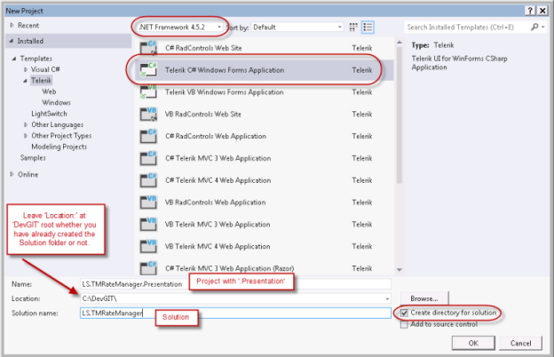
- New Project dialog
- Choose .NET Framework version from dropdown. (Currently 4.5.2)
- “Templates | Telerik | Windows”
- Choose “C# RadControls Windows Forms Application”
- Enter a Project name like “LS.TelerikControls.Presentation”
- Enter a Solution name like “LS.TelerikControls”
- Enter a root path (“C:\DevGIT”) but don’t specify the solution folder. That will be created when you…
- Check the box to “Create directory for solution”
- Project Configuration Wizard dialog
- Next select the Project and use the Telerik ‘Configuration Wizard’ (“Telerik | UI for WinForms | Configure Project”) to pick the ‘Components’ and ‘Themes’ required by your application.
You can return to this dialog later by: “Telerik | UI for WinForms | Configure Project”.
### SOMEWHERE WE NEED TO SET THiS. I’m not sure where in the new Telerik version: Choose “UI for WinForms, v. XXX (Dev) [GAC]”. This is our new plan starting with v2015.2.728.40

- Configure Project
- Choose “UI for WinForms, v. XXX (Dev) [GAC]”. This is our new plan starting with v2015.2.728.40

- Choose Components
- Telerik.WinControls
- Telerik.WinControls.GridView (unless it won't be used)
- Telerik.WinControls.RadDock (unless it won't be used)
- Telerik.WinControls.UI
- Telerik.Common appears to be included by default

- Themes tab

- We use these themes
- Telerik.WinControls.Themes.Desert
- Telerik.WinControls.Themes.Office2010Black
- Telerik.WinControls.Themes.Office2010Blue
- Telerik.WinControls.Themes.Office2010Silver
- Telerik.WinControls.Themes.Office2013Dark
- Telerik.WinControls.Themes.Office2013Light
- Telerik.WinControls.Themes.TelerikMetro
- Telerik.WinControls.Themes.TelerikMetroBlue
- Telerik.WinControls.Themes.Windows7
- Telerik.WinControls.Themes.Windows8
4. Click <Finish>
- Rename the RadForm1 to rfrmMain
5.Setup rfrmMain
- Open the rfrmMain design view and open the 'Document Outline' view. If you added a RadRibbonForm then it will automatically include a 'panel1' Panel. You could use this as the main container, or replace it with a RadDock, etc. If the form doesn't include a main container then add some type of container (typically RadPanel, or RadDock if you want dockable panels) as a master container on the form then dock it to all sides.
- Set a default form size if you wish, Good options are:
- 800×600 rez form size: 750,550
- 1024×768 rez form size: 1000,700
Telerik Systray App
See this video: \\192.168.93.1\KB_MiM\Telerik\20140820) Telerik Systray App with Larry\20140820) Telerik Systray App with Larry.mp4
My sample project: \\192.168.93.1\KB_MiM\Telerik\LS.TelerikSystrayApp
Steps to create a SysTray app
- You must add a Windows NotifyIcon (call it ‘niMain’) control from the Toolbox to rfrmMain to make a Systray app.
- Next add a RadContextMenu (call it ‘rcmMain’) to rfrmMain. This and niMain won’t appear on the form itself, but in the tray below.
- Click the tasks arrow button on the ‘rcmMain’ control and click “Edit Items” and add the menu items you want to to make available from your Systray icon. Here’s an example from eTMsync:
- Add an icon (must be *.ico) to the niMain.Icon property.
- Add click events for the SysTray (niMain.Items) menu items.


- Select the form that contains the niMain, then choose the rmiItem control from the properties list.

- Now double click in the ‘Click’ event to stub out the ‘niMain_MouseDown’ event handler.


Insert this code:
4. Now hide rfrmMain so the user only sees the Systray icon. Add this code right after InitializeComponent(); in the public rfrmMain().
// Hide rfrmMain by default for a SysTray app
WindowState = FormWindowState.Minimized; //minimize rfrmMain
ShowInTaskbar = false; // ...and don't show it on the TaskBar
7. Open the rfrmMain in design view, select each of the rcmMain menu items you create from the Properties tool window dropdown. Switch from Properties to Events and add a ‘Click’ event handler.
8. ### What next??
Per this post you can bind a RadContextMenu (rcmMain) to the NotifyIcon control. http://www.telerik.com/forums/radcontextmenu-notifyicon
Add an ‘icon’ (must be *.ico) to the Windows NotifyIcon (niMain) control so it will be visible in the systray.
Start frmMain hidden
public frmMain()
{
    InitializeComponent();
    //Visible = false; %%//%% hide the form by default - THIS METHOD DOESN'T WORK. Do this instead:
    WindowState = FormWindowState.Minimized; %%//%% minimize frmMain
    ShowInTaskbar = false; %%//%% ...and don't show it on the TaskBar
Pop the systray menu on mouse click (bind the RadContextmenu to the NotifyIcon)
//pop systray menu on mouse click
void niMain_MouseDown(object sender, MouseEventArgs e)
{
    if (e.Button == System.Windows.Forms.MouseButtons.Left) %%//%% click left mouse button on SysTray
    icon to pop the menu
    rcmMain.Show(MousePosition); %%//%% bind the RadContextmenu to the NotifyIcon
}
Show/Hide frmMain on Minimize
### I’m not sure the following really works. Test it. I had to minimize and set ShowInTaskbar = false; above.
Visual Studio Info, Shortcuts & Tricks
Shortcut Keys
Outline View: “View | Other Windows | Document Outline” or <Ctrl><W>, <U>
Code Autoformat <Ctrl><K>,<D> (only works if there are no errors in the code)
Add Resources to a Solution (Icons, Graphics, Files, etc.)
Video: \\192.168.93.1\KB_MiM\Telerik\20160204) Add Icon Graphics to a VS Solution (Project Resource File).mp4
Click the <…> button on the ‘Image’ property of a radCommandBar button item (for example) and…


Committing newly added Resources to GIT

Our Source File Structure
Solution Structure:
- LS.{name}.Library - business logic
- LS.{name} or LS.{name}.Presentation - main application
- LS.{name}.Tests - unit tests
- LS.{name}.{project} - specific implementation of an application concept that I think should be in its own assembly; for example, database access
Project Structure:
- Contracts / Interfaces - the interfaces; I don't usually use the “I” prefix as I dislike the (bad) Hungarian notation and also I want *these* to be the primary concepts in the application
- Models - the (usually) dumb classes, objects that just carry data and usually have no / very few methods and should have no dependencies
- Implementations / Services - the implementations of the interfaces
[ Source File Structure ]
// TODOs
// Namespace starts here
// CLASS STARTS HERE
// Static methods, if any
// Events, if any
// Constructor
// Public Properties
// Public Methods
// ← an empty comment line
// Private Fields
// Private Properties
// Private Methods
// ← an empty comment line IF there are any event handlers
// Event Handlers
// use this ordering:
// _Load
// _Shown
// _Closing
// _Close
// CLASS ENDS HERE
// Namespace ends here
// DONE TODOs
TODO Comments
http://www.dotnetperls.com/todo
Create tasks in the source code which appear on the VS ‘Task List’ pane.
//TODO: LARRY - work on version with no bugs
As a coder completes each TODO change the ‘TODO’ to ‘DONE’ and leave the comment in place to act as future documentation.
These tasks will appear in event handlers and stubbed out methods.
We will keep other tasks that define other functionality in a file named ‘XXXX—Spec-Todos.cs’ in the Project where ‘XXXX’ is the code file that the Spec-Todos file describes. For example ‘rfrmMain—Spec-Todos.cs’ might contain TODO entries describing the big steps that must be completed in the application. It would also contain TODOs describing code for controls which aren’t responding to an event (i.e. how a form will be setup, or details of how a GridView is to be configured). Another example of this file could be ‘Program—Spec-Todos.cs’. Here’s anexample of a TODO in a ‘rfrmMain—Spec-Todos.cs: file:
//TODO: Marcel - 'ucGridStatusModuleStatusConsole' - Populate the GridView with these columns in the following order. // Each of the values are provided by the plugin (module) via some way they report their settings and status. // Some of these values will be defined on the plugin Options form where they will be defaulted to design time values. // 'Enable' - Checkbox column. Unchecked disables all activity for this module. // 'Category' - A text string name assigned to each category. // 'Module' - The module name reported by each plugin.
NOTE: When adding a ‘XXXX—Spec-Todos.cs’ to a Project right click the Project | Add | New Item | and choose ‘Code File’ for a blank .cs file, or simply press <Shift><Alt><C> to add a class.cs file, then delete the stubbed out contents.
### At some point we may add date stamps to track the original creation date and completion date of a TODO.
Build
Set the Build Output Folder
- On the Project menu, click Properties.
- Click the Build tab.
- Click the Browse button next to the Output path box and select a new build output directory.
Remove the Namespace from the Build Output (EXE) File Name
Go from something like this: ‘MiM.ForensicDataCollector.Presentation.exe’ to something like this: ‘ForensicDataCollector.exe’

What about our DLL folder plan? How do you adjust References and “Copy Local”?
Copy the required DLL’s to the build folder
For each Telerik assembly reference in the Solution Explorer, open its context menu, click on properties and in the property grid set the Copy Local property of the reference to True. Thus these Telerik assemblies will be copied to your Release/Bin, Debug/Bin folders
Deployment
Telerik Application Deployment
ILMerge Telerik WinForms assemblies
When you deploy your application, you may prefer to do it as a single executable rather than an executable referencing many external assemblies. In this case, you need to ILMerge the assemblies with the executable. Here is a link to MSDN from where you can download the ILMerge executable: Download ILMerge
Application Icons –Multisize ICO files
ICO files can have multiple sizes of the icon image contained within it by using layers. You do this so that the 16×16 size is used for the app's top bar but the 32×32 size version is used when showing open apps via Alt-Tab.

Here’s an explaination and some tool options to make multisize ISO files.
http://stackoverflow.com/questions/4354617/how-to-make-get-a-multi-size-ico-file
Upload a larger (<4MB) square aspect ratio PNG file and this will provide a multi-rez download ICO file.
https://www.icoconverter.com/
Add updater
Need to add a rmi for Check for Updates. The updater.exe will live in the same location as the application exe file.
Telerik Common Properties
- UseMnemonic is a boolean property which controls whether the & character is displayed as the symbol itself or whether it is used to designate a mnemonic (visualized as an underscore). Its default value is true i.e. mnemonics are used by default. Specify the character that will be used for a given control by placing the & character before the desired symbol.
Forms
Use Telerik .NET (4.x) forms to our WinForms projects. LS.Common for WinForms doesn’t yet support .NET Core.

Borders
this.FormBorderStyle = System.Windows.Forms.FormBorderStyle.None; // Control the type of form border
- None
- FixedSingle
- FixedDialog
- Sizable
- FixedToolWindow
- SizableToolWindow
TitleBar
this.ControlBox = false; // hide the form control buttons
this.Text = String.Empty; // hide (collapse) the form titlebar
this.Text = " "; // show the form titlebar but display no text
Position
Center a form on screen
this.StartPosition = CenterScreen; // Center the form on screen when it is opened
- Manual
- CenterScreen
- WindowsDefaultLocation
- WindowsDefaultBounds
- CenterParent
CenterToScreen(); // move the form to center screen while it is already open
Size
For a fixed size window, you still use FormBorderStyle.SizableToolWindow. If you want to really enforce the size, you could also set MinimumSize equal to MaximumSize on the form.
Force a form to a specific size
int CollapsedWidth = 505; // default size when collapsed (History is NOT visible)
int CollapsedHeight = 258;

public rfrmMain()
{
    InitializeComponent();
    Width = CollapsedWidth; // set the default collapsed form size
    Height = CollapsedHeight;
    …
Resize a form to display a hidden area based on a Toggle button (from ‘LS.GIT_TM_TimeTracker’)
AutoScaleMode
Windows application Forms and UserControls must use the same autoscalemode. Different settings may cause the Form or UserControl (and their contents) to scale/draw incorrectly at runtime. This issue may not be visible in Visual Studio. Always use AutoScaleMode.None for the default setting within any design work.

For example:

Use Search/Replace to correct this solution-wide.

frmMain
The primary form they see when the app opens (after any splash screen, etc. Others are frmAbout, etc.)
Telerik Form Templates
http://docs.telerik.com/devtools/winforms/forms-and-dialogs/templates/templates
The Visual Studio templates that install with Telerik UI for for WinForms let you add RadForm and ShapedForm to your application without any coding steps. There are also two other specialized forms, RadRibbonForm that contains a built-in RadRibbonBar and RadAboutBox that is an enhanced, themeable version of the regular AboutBox.

RadForm - rfrm
http://docs.telerik.com/devtools/winforms/forms-and-dialogs/form/form
http://www.telerik.com/help/winforms/forms-and-dialogs-form-getting-started.html
http://www.telerik.com/community/forums/winforms/forms-and-dialogs.aspx
The RadForm control is an extended standard Windows Form that fully supports the Telerik Presentation Framework (TPF) and the Telerik's theming mechanism. The control is built of a RadTitleBar component and a border that can be easily designed in the Visual Style Builder. RadForm also supports MDI (Multiple Document Interface).

Note: RadForm supports just one shape. See ShapedForm for more advance shapes.
- 'AutoSize' \Layout
- 'Size' \Layout
- A good default main form size is 1000×700. SOME OTHER PROPERTY blocks a new Size entry, so drag the form to resize, then you can enter a specific size.
- You can disable resizing a form in a couple of ways:
- Set the ‘MinimumSize’ and ‘MaximumSize’ to the same value, and set the ‘MaximizeBox’ to False
- ‘FormBorderStyle’ to ‘FixedSizeToolWindow” (or one of the other options) and set ‘ControlBox’ to False. (Don’t set the ‘FormBorderStyle’ to ‘None’ or you can’t move the window.
RadRibbonForm
http://www.telerik.com/help/winforms/ribbonbar-overview.html
http://www.telerik.com/community/forums/winforms/forms-and-dialogs.aspx
http://www.telerik.com/community/forums/winforms/ribbonbar.aspx
The RadRibbonForm control is designed to host a RadRibbonBar control and mimic the Microsoft Office 2007 UI form style. This control automatically detects whether it runs under Windows Vista and Desktop Window Manager Effects are enabled and adjusts itself to make use of these effects just as Microsoft Office 2007 applications do.

Really the thing to do here is add a RadRibbonForm to the Solution rather than adding a RadRibbonBar to a regular RadForm.
A RadForm preloaded with a RadRibbonBar, a “System.Windows.Form.Panel” in the middle and a RadStatusStrip on bottom. You can drop the panel and replace with a RadPanel if you want.
See RadRibbonBar for more info
For a RadRibbonForm the 'Document Outline' view will show:
- RadRibbonForm1
- panel1
- radStatusStrip1
- radRibbonBar1
Notice the order. The panel1 is the main container and is followed by the radStatusStrip1 with the radRibbonBar1 at the bottom. Do not change this order!
RadStatusStrip – rss
http://www.telerik.com/help/winforms/forms-and-dialogs-statusstrip-overview.html
http://www.telerik.com/community/forums/winforms/forms-and-dialogs.aspx
RadStatusStrip provides a status area that can be composed of any number of RadElement types: buttons, repeat buttons, image buttons, labels, panels, progress bars and separators. The elements can be laid out along the horizontal or wrapped to additional rows.

The following element types can be added to RadStatusStrip.Items collection:
- RadLabelElement
- CommandBarSeparator
- RadButtonElement
- RadCheckBoxElement
- RadImageButtonElement
- RadProgressBarElement
- RadRadioButtonElement
- RadRepeatButtonElement
- RadSplitButtonElement
- RadStatusStripPanelElement
- RadToggleButtonElement
- RadTrackBarElement
- RadWaitingBarElement
Properties
- LayoutStyle property handles the arrangement of items when they exceed the horizontal space in the status bar.
- Stack (the default) arranges items from left to right and the rightmost items that exceed the horizontal space are not visible.
- Overflow moves items in excess of the horizontal space to the following line.
- By default the grip is Hidden. The image below shows GripStyle set to Visible.
If you Dock a panel (or TableLayoutPanel) control to the form and it appears behind the RadStatusStrip, collapse the panel in the Document Outline, then drag it above the RadStatusStrip like this:

RadAboutBox
http://www.telerik.com/help/winforms/forms-and-dialogs-templates-radaboutbox-overview.html
http://www.telerik.com/products/winforms/aboutbox.aspx
This isn’t a control in the toolbox. It is a form template you can add to a project. Like any other form, the RadAboutForm may be resized and configured in the IDE.
The Telerik version looks just like the standard version that comes with VS.
The form contains a TableLayoutPanel with a logoPictureBox (image) in the left column, an <OK> on the lower right and the following rows in the right column:
- Product Name (RadLabel)
- Version (RadLabel)
- Copyright (RadLabel)
- Company Name (RadLabel)
- Description (multiline RadTextBox)
These text values are populated from the “Project | Properties | Application | <Assembly Information> | Title”.
The form title bar is populated from the “Project | Properties | Application | <Assembly Information>”.
NOTE: The default application icon is also set on the “Project | Properties | Application” tab.
The logoPictureBox is ‘Size’: 122, 259 with ‘SizeMode’: StretchImage. The ‘logoPictureBox.Image’ property defines the graphic. The default Telerik sample image size is 120×262.
Add a RadAboutBox to a Project
- Click “TELERIK | RadControls for WinForms | Add RadAboutBox”
- Name the form “rfrmRadAboutBox” and click <Add>
The code behind “rfrmRadAboutBox”automatically contains some default code. I’ve modified it here for our purposes so paste this instead):
Insert the Trademark ® by holding <Alt> and typing 0174 on Numpad.
NOTE: To access the Assembly info (for Product Name, etc), you must start by adding a Project Reference to:
‘X:\DevGIT\ls.common\LS.Common.Utilities\bin\Debug\LS.Common.Utilities.dll’
Then add using LS.Common; // provide access to the Assembly to any .cs file that requires access to the Assembly.
Alternatively, you can also set the defaults in the Form Load event.
private void rfrmRadAboutBox_Load(object sender, EventArgs e)
{
    Text = $"About {SystemSettings.AssemblyData.Title}"; // AboutBox form.text title from Assembly text ("About %title%")
}
Example About Box Description for our custom applications

The RadAboutBox pulls its info from the Assembly information (from the Project Properties).
Per the comment you can edit the AboutBox content by
- Changing the Assembly information either directly in the IDE
- By editing the \Properties\AssemblyInfo.cs file.
- Or you could override the Assembly info above and hard code whatever you want.
Display the RadAboutBox form like any other:
private void rmiAbout_Click(object sender, EventArgs e)
{
    using (rfrmRadAboutBox rfrmRadAboutBox = new rfrmRadAboutBox()) // create an instance of the form
    {
      rfrmRadAboutBox.ShowDialog(this); // then show/opens it
    }
}

Note the text from the Assembly Info dialog above
Change the AboutBox Picture

In the design view, click the picture box element and view properties. Select to change the image and select project resources. Import image like below.

RadShapedForm – rfrmshp
http://docs.telerik.com/devtools/winforms/forms-and-dialogs/shapedform/shapedform
The ShapedForm control allows you to design and display a Windows form with any conceivable shape. You can couple this control with the RadTitleBar control to easily add forms with a completely custom look and feel.

Control Notes & Naming Conventions
Common Control Properties
Dock - Property on various controls to fill a space (container)
- 'Dock' \Layout
Anchor - Anchor to any or all 4 sides of container to auto-resize with container. Works well within a TableLayoutPanel control.
- 'Anchor' \Layout
Windows Controls (Non-Telerik)
LinkLabel – llbl
NOTE: Instead of LinkLabel see the <Links> button on the ‘MarkupEditor’ behind the ‘RadLabel.Text’ property dropdown. Enter a url there and the link works with no extra code.
- ‘LinkColor’ = 52, 84, 134 to match Telerik Wizard Help link
- ‘BackColor’ = 208, 225, 251 to match the default theme
Here’s code to open the default browser to a site on LinkLabel click
* TableLayoutPanel –tlp
Not a Telerik control. Use table to specify control layout on form.
Quick Tasks Button
- 'Add Column', 'Add Row', 'Remove Last Column', 'Remove Last Row' - use these to build desired table layout
'Edit Rows and Columns'
'Columns'
- 'Percent' set to 100% even if another Column occupies an 'Absolute' amount of space
'Rows'
- 'Absolute' set to 30 pixels high to hold regular buttons at 24 pixels high
- Use 40 pixels high for the buttons on bottom of a form
- 'Percent' set to 100% even if another Row occupies an 'Absolute' amount of space
</p>
- 'ColumnSpan', 'RowSpan' - allow a control to span multiple Columns/Rows
- 'Anchor' - align or stretch a control within a cell (NOTE: Larry prefers 'Dock')
- 'Dock' - stretch the TableLayoutPanel it's parent container

// Columns and rows are 0 based so this references the 2nd column: TableLayoutPanel1.ColumnStyles[1]
// Hide an entire TableLayoutPanel - good to hide a subpanel in a single master tlp cell
tableLayoutPanel1.Visible = false;
// Hide/Show TableLayoutPanel row/column (works for SizeType = Absolute (pixels) or Percent)
tableLayoutPanel1.RowStyles[8].Height = 0; // Hide row 8 (9th) by setting height to 0
tableLayoutPanel1.RowStyles[8].Height = 33; // Show row 8 (9th) by setting height to 33 (good size for a button)
TableLayoutPanel1.ColumnStyles[1].Width = 0; // Hide column 1 (2nd) by setting width to 0
Create a user control property that shows/hides a column based on the size of 2 buttons inside a child layout panel.
[Category("Legality Software")]
public bool ViewsExpandCollapseAllVisible
{
    get { return tlpQueryListTree.ColumnStyles[2].Width == rbtnTreeExpandAll.Width + rbtnTreeCollapseAll.Width + 14; } // return true if col currently as wide as buttons + 14px buffer
    set { if (value)
            tlpQueryListTree.ColumnStyles[2].Width = rbtnTreeExpandAll.Width + rbtnTreeCollapseAll.Width + 14; // Show the column (set size to width of buttons + 14px buffer)
          else
            tlpQueryListTree.ColumnStyles[2].Width = 0; %%//%% Hide the column (set width = 0)
        }
}
Also see Setup Properties Configurable in the VS IDE for more show/hide column/row options as uc Properties via the IDE
// Set row/column Size Type to Absolute or Percent
tableLayoutPanel1.RowStyles[0].SizeType = SizeType.Percent;
tableLayoutPanel1.RowStyles[0].SizeType = SizeType.Absolute;
TableLayoutPanel1.ColumnStyles[1].SizeType = SizeType.Absolute;
Issues Moving Controls to Different TableLayoutPanel Cells
Whenever you try to drag a control or block of controls from one TableLayoutPanel cell to another you may find the controls land in the wrong cell. Often creating a new tlp rox and dropping the controls there.
This is because the controls you are moving probably have a 'ColumnSpan' or 'RowSpan' property setting that causes the control(s) to occupy more than one cell. When you drag it VS creates a new tlp row to hold the extra cells required by the Span property.
The solution is to remove any 'ColumnSpan' or 'RowSpan' settings
RadLayoutControl – rloc
http://www.telerik.com/help/winforms/layoutcontrol-overview.html
With RadLayoutControl you can quickly design and arrange your controls in complex layouts and it will automatically keep the layout consistent at run-time. RadLayoutControl has an intuitive and straight-forward design time experience. When resizing the form, it keeps its layout consistent by proportionally resizing the controls in it while considering their MinSize and MaxSize settings. RadLayoutControl also allows end-user customizations and Save/Load layout via the Customize context menu.

Main features of the control:
- Create complex layouts where the controls are automatically resized according to the current available size.
- Arrange the controls in the form at runtime - your users will be able to rearrange the controls according to their needs.
- Save and load the layout.
- Group the underlying controls in tabs.
- Expand/Collapse groups.
ToolTip – ttip
Drag this regular Windows (non-Telerik) control to any spot on the form (it will not be visible). The name doesn’t matter.
It will add a ‘ToolTip on toolTip’ property to the Rad Controls that don’t already have a ‘ToolTip’ property.
PictureBox
Windows Common Control shows a picture.
- 'Image' <…> or Quick Tasks Button
- Choose “(o) Project resource file” then <Import> (copies the picture into the project)
- 'SizeMode' = 'AutoSize' to automatically stretch the image.
Telerik – Dialogs
RadColorDialog
RadMarkupDialog
RadMarkupEditor and RadMarkupDialog require a reference to Microsoft.mshtml assembly and if you need to use them at Run Time you will need to distribute this assembly to the end user computers as well. You can find further information about that in this external resource:
http://msdn.microsoft.com/en-us/library/w0dt2w20.aspx
You do not need to do anything on your developer machine, because Visual Studio provides the required assembly. Also if your application does not use the editor or the dialog, you do not need a reference to this assembly.
* RadAboutBox
http://www.telerik.com/help/winforms/forms-and-dialogs-templates-radaboutbox-overview.html
This isn’t really a control in the toolbox. It is a form template you can add to a project.
For more info see this part of the doc: RadAboutBox
* RadMessageBox
http://www.telerik.com/help/winforms/forms-and-dialogs-messagebox-overview.html
http://www.telerik.com/help/winforms/forms-and-dialogs-messagebox-parameters.html
RadMessageBox displays a modal dialog box that contains a system icon, a set of buttons, and a brief application-specific message, such as status or error information. You cannot create a new instance of the RadMessageBox class. To display a message box, call the static method
RadMessageBox.Show. The title, message, buttons, and icons displayed in the message box are determined by parameters that you pass to this method.

Parameters
- Parent - An implementation of System.Windows.Forms.IWin32Window that will own the RadMessageBox.
- Text - The text to display in the RadMessageBox.
- Caption - The text to display in the title bar of the RadMessageBox.
- Buttons - One of the MessageBoxButtons enumeration values that specifies which buttons to display in the message box:
- AbortRetryIgnore
- OK
- OKCancel
- RetryCancel
- YesNo
- YesNoCancel
- Icon - One of the RadMessageIcon enumeration values that specifies which icon to display in the message box or a custom Bitmap icon that will be displayed:
- RadMessageIcon.None
- RadMessageIcon.Info
- RadMessageIcon.Question
- RadMessageIcon.Exclamation
- RadMessageIcon.Error
- defaultBtn - One of the MessageBoxDefaultButton enumeration values the specifies the default button for the message box:
- MessageBoxDefaultButton.Button1
- MessageBoxDefaultButton.Button2
- MessageBoxDefaultButton.Button2
- Rtl - RightToLeft settings:
- RightToLeft.No
- RightToLeft.Yes
- RightToLeft.Inherit
Details Section
RadMessageBox supports details section, shown by specifying the details text in the Show method parameters:
RadMessageBox.Show("Message text", "Title/Caption Text", MessageBoxButtons.AbortRetryIgnore, "Details Text");

Examples
RadColorDialog
http://docs.telerik.com/devtools/winforms/forms-and-dialogs/colordialog/colordialog
RadColorDialog is a lightweight UI component that allows users to select from RGB or HEX color models. The color palettes are skinnable and highly configurable. It offers a great amount of flexibility in selecting colors from web, system, and basic colors together with the ability to fine-tune and pick colors directly from the screen.

Telerik – Containers
Start every form with some kind of container. Could be a RadPanel at minimum.
* RadDock – rd
http://www.telerik.com/help/winforms/dock-overview.html
http://www.telerik.com/community/forums/winforms/dock.aspx
http://www.telerik.com/help/winforms/dock-object-model-tabs-and-captions.html
http://www.telerik.com/help/winforms/dock-architecture-and-features-understanding-raddock.html
Video: http://www.telerik.com/videos/winforms/getting-started-with-raddock-for-winforms
Video: http://www.telerik.com/videos/winforms/introducing-the-new-raddock-for-winforms
Container for collapsable/dockable panels called ‘ToolWindows’ (like the “Properties” panel in VS). This is what holds the queries in SQLL - NOT TRUE???. Once the container exists you use “Dock New Window to Right (etc)” from the Quick Tasks Button. Also try “Show Advanced Layout Designer”.
A new RadDock can directly hold a DocumentContainer and ToolTabStrips which contain ToolWindow(s) and RadSplitContainers as required. The DocumentContainer holds a DocumentTabStrip which in turn holds DocumentWindow(s). You must add at least one of these before you can add other objects.
SizeMode Info
http://www.telerik.com/forums/tabstrip-sizeinfo-not-changing-the-size
// You must set both SizeMode and AbsoluteSize properties
window4.TabStrip.SizeInfo.SizeMode = SplitPanelSizeMode.Absolute;
window4.TabStrip.SizeInfo.AbsoluteSize = new Size(150, 0); // absolutely 150 pixels wide
window2.TabStrip.SizeInfo.SizeMode = SplitPanelSizeMode.Relative;
window2.TabStrip.SizeInfo.RelativeRatio = new SizeF(0, 0.33f); // relatively 1/3 of the other window
RadDock Properties (parent container)
You will probably have to select the Dock control from the VS ‘Document Outlline’
this.radDock1.DocumentTabsAlignment = TabStripAlignment.Left; // Show the documentWindow tab strip on the left edge
this.radDock1.DocumentTabsTextOrientation //
this.radDock1.DocumentTabsVisible = False; // Hide the tabs for all documents
this.radDock1.DragDropAllowedStates = All // Docked, TabbedDocument, Hidden, AutoHide, Floating
- DocumentTabsVisible – hide document tabs – good if you want to only show a single document window as the main app window
- DocumentTabsAlignment – Top, Bottom, etc
- DocumentTabsTextOrientation
- MainDocumentContainerVisible – hide all documents in this container
this.radDock1.MainDocumentContainerVisible = false;
- Orientation – Horiz/Vertical
- ShowDocumentCloseButton – close button(s) on each document tab
- ShowDocumentPinButton – whether DocumentTabStrip instances display a stickpin button
- ShowItemToolTips –
- ShowToolCloseButton – Control whether ToolTabStrip instances will display Close Button next to each item
- SplitterWidth – default = 3, how prominent is the slplitter bar and control? Set to 0 for no splitters.
- ToolTabsVisible
- ToolTabsAlignment – Top, Bottom, etc
- ToolTabsTextOrientation


DocumentContainer – rddc (child container)
- Contains all the DocumentWindow objects, which consist of:
DocumentTabStrip – rddts (grandchild control)
- Tabs that represent different 'DocumentWindow' objects and optional control buttons
- Click on the right end (on the ‘X’) to select the tab strip
documentTabStrip1.TabStripVisible = False; // Hide the DocumentTabStrip (to hide the doc window tabs and global close button)
DocumentWindow – rddw (great grandchild control)
Individual Document Windows, like source files in VS You can put a RadSplitContainer in a documentWindow, but not right in the RadDock
- DefaultFloatingSize –
- radDock.DocumentButtons = none; // Hide the buttons (like close) in the upper right of a documentWindow
- DocumentButtons options – All, None, Close, ActiveWindowsList, SystemMenu – buttons on right of DocumentTabStrip. NOTE: This must be set for each DocumentWindow. It seems like this would be a DocumentTabStrip property that is global to all DocumentWindows, but apparently not.
- radDock.DocumentTabsVisible = false; // Hide the documentWindow tab area on the RadDock. If you do, you don’t need to use ‘DocumentButtons’ = None
- this.radDock1.ShowDocumentCloseButton = false; // Hide the documentWindow close button
- documentWindow1.CloseAction // Controls what happens when you close a window,
- Close
- CloseAndDispose – default is to to destroy Window on close request
- Hide – use this if you want to hide a window and be able to restore it
Hide/Show a DocumentWindow
documentWindow1.CloseAction = Telerik.WinControls.UI.Docking.DockWindowCloseAction.Hide; // CloseAction = Hide, else Window is destroyed on close request
documentWindow1.DockState == DockState.Hidden // Hide documentWindow
documentWindow1.DockState == DockState.TabbedDocument // Show documentWindow
documentWindow1.DockState = documentWindow1.DockState == DockState.Hidden ? DockState.TabbedDocument : DockState.Hidden; // Toggle Show/Hide

DockWindow[] hiddenWindows = this.radDock1.DockWindows.GetWindows(DockState.Hidden); // Get a collection of all Hidden documentWindows
Here’s another way:
//Hide document window tab on main form
documentWindow3.TabStripItem.Visibility = ElementVisibility.Collapsed;
ToolTabStrip – rdtwts (child container)
Header strip above a ToolWindow with optional caption text and control buttons Click on the right end (on the ‘X’) to select the tool window tab strip
this.toolTabStrip1.Text = ‘This is irrelevant!’; // The Text on the ToolStrip is controlled by the ToolWindow.Text property
this.toolTabStrip1.CaptionVisible = false; // Hide the caption of a single ToolTabStrip
this.radDock1.ShowToolCloseButton = false; // Hide the ToolWindow close button
this.AllowedDockState = AllowedDockState.AutoHide | AllowedDockState.Docked; // Force stay docked and not allow the user to move it
this.DockState = Telerik.WinControls.UI.Docking.DockState.AutoHide; // Collapse/AutoHide the ToolWindow (not visible in the IDE)
//Options: AutoHide, Docked, Floating, Hidden, TabbedDocument
ToolWindow – rdtw (grandchild control)
Window dockable to any of the 4 sides by default, like VS Properties window
See this article on AllowedDockStates to control floating, etc. And this: http://www.telerik.com/forums/909245-disable-the-floating-feature
Click in the tool window body (below the ToolTabStrip)
- ToolCaptionButtons - None, Close, AutoHide (the stickpin), SystemMenu, All – buttons on right of ToolWindow
 this.ToolCaptionButtons = ToolStripCaptionButtons.AutoHide; // Shows only the stickpin. Options:
// None – no buttons
// Close – if you close you can’t get it back
// Autohide – only show the stickpin
// SystemMenu – drop down with multiple options
// All
this.radDock1.ToolTabsAlignment = TabStripAlignment.Right; // Show the ToolWindow tab strip on the left edge
this.radDock1.ToolTabsVisible = false; // Hide the ToolWindow tab area on the RadDock
ContextMenuStrip –shortcut menu to display on right click
**toolWindow.Caption** – Text header that appears on ToolTabStrip above the ToolWindow.
**toolWindow.text** – Text in the expand button visible when the ToolWindow is unpinned. //(.Caption is the text in the ToolTabStrip above the ToolWindow.)
// Only allow ToolWindows to resize, autohide and pin ### Fix this code sample up – wrong syntax
// From: http://www.telerik.com/forums/how-to-disable-toolwindow-floating-after-double-click-header
Me.ToolWindow1.AllowedDockState = Telerik.WinControls.UI.Docking.AllowedDockState.All And Not Telerik.WinControls.UI.Docking.AllowedDockState.Floating
RadPanorama – rp
* RadPageView – rpv
http://www.telerik.com/help/winforms/pageview-overview.html
http://www.telerik.com/community/forums/winforms/page-view.aspx
Video: http:%%//%%www.telerik.com/videos/winforms/getting-started-with-radPageView
RadPageViewPage.ViewMode // Types (ViewMode) of page displays. Options are:
- Strip – regular tabs across one of the 4 edges

- Stack – An accordion style stack with the selected page name (header) on top, the buttons on 1 of 4 sides and the content displayed next to, on-top of the items’ stack, or next to the selected item (where the buttons move as selected).

- RadPageViewPage.ViewElement.StackPosition – specify which side buttons are on
- RadPageViewPage.ViewElement.ItemSelectionMode - content displayed on-top of the item button stack, or next to the selected item (where the buttons move as selected)
- Standard – content above button/item stack. Buttons don’t move.
- ContentWithSelected – content between buttons which move move as selected (probably best)
- ContentAfterSelected – content and buttons move here as well but it’s hard to tell which button
- RadPageViewPage.ViewElement.ItemSizeMode – maybe look at this one too
- Outlook – Buttons stay stacked on the bottom and the pages appear like the left pane of Outlook

- ExplorerBar – display multiple visible pages at once in a scrolling mechanis. Offers 3 types of content sizing (FixedLength, AutoSizeToBestFit, EqualLength) & 2 stack positions (Top, Left). In this case the Headings move up and down with the data. They even move vertically outside the visible area possibly leaving the user unsure of context.

- BackStage – options on left with a cute graphic indicator and selected page on right


- Add as a child to an existing container: 1st select the container then double click the RadPageView control to add
- Text - choose the parent 'RadPageView' or child 'RadPageViewPage#' from the Property panel dropdown to change properties for each page button
- The ‘Pages’ collection (in the Property Grid) defines the individual pages at design time
Quick Tasks Button
- 'Add Page' to add pages
- 'Strip Buttons' = “None” to hide <X> (like titlebar)
- ‘Item content Orientation’ list of tabs appear vertical, horizontal or auto next to page
- 'Strip Alignment' Tabs should appear on which edge?
- 'Item Fit Mode' controls size of Page Tabs
- 'View Mode' controls layout of pages providing tabs, or Outlook style accordian
Scrollable Page Contents in non-Strip View Mode (as in dbEntreé)
- A good way to create scrollable sections within a non-Strip (standard tabs) View Mode is to create a user control and size it vertically to contain all the required controls. This enables you to scroll up/down in the user control in the IDE to edit the sub-controls.
- Next Dock Fill a RadScrollablePanel in the RadPageView Page.
- Finally Top, Left, Right Anchor the user control in the RadScrollablePanel (don’t Dock it) and they scrollable panel will adjust to the user control height.
- Remember to Left, Right anchor the controls in the user control is they adjust with the width of the PageView.
Page Visibility
NOTE: You cannot hide the PageView tabs by changing a design time property. You must edit the code to set the 'ElementVisibility.Collapsed' property for each RadPageView page as shown here:
Hide all RadPageView Pages/tabs
// Stick this right after “InitializeComponent();” on the form or UC.
// Hide all RadPageView 'Page' tabs
foreach (Telerik.WinControls.UI.RadPageViewPage item in radPageView.Pages) {
      item.Item.Visibility = Telerik.WinControls.ElementVisibility.Collapsed;
    }
Hide any RadPageView Page/tab with 'Name' = “Hidden” or where 'Text' contains “Hidden”
// Hide any RadPageView Page with 'Name' = "Hidden" or where 'Text' contains "Hidden" (just the tab, not content)
foreach (Telerik.WinControls.UI.RadPageViewPage item in radPageView.Pages ) {
    if (item.Text.ToLower().Contains("hidden") == true || item.Name.ToLower().Contains("hidden") == true)
      item.Item.Visibility = Telerik.WinControls.ElementVisibility.Collapsed; // Must use lower case text
}
Hide a specific RadPageView Page/tab by name
foreach (Telerik.WinControls.UI.RadPageViewPage item in radPageView.Pages) // Hide a RadPageView Page with a specific 'Name'
  if (item.Name.Contains("rpvpContactSupport") == true)
    item.Item.Visibility = Telerik.WinControls.ElementVisibility.Collapsed;
Or multiple pages…
foreach (RadPageViewPage item in rpvListViewSettings.Pages) // Hide a RadPageView Page(s) with specific 'Name'(s)
  if (item.Name.Contains("rpvpListSavedViews") || item.Name.Contains("rpvpListToolbar"))
    item.Item.Visibility = Telerik.WinControls.ElementVisibility.Collapsed;
Hide a specific RadPageView Page/tab with specific tab text
foreach (Telerik.WinControls.UI.RadPageViewPage item in radPageView.Pages) // Hide a specific RadPageView Page/tab with specified tab text
  if (item.Text.Equals("Contact Support") == true)
    item.Item.Visibility = Telerik.WinControls.ElementVisibility.Collapsed;
Page Selection
Select the currently configured DefaultPage
rpvListViewSettings.SelectedPage = rpvListViewSettings.DefaultPage; // select the currently configured default page
Select the 1st Page on the RadPageView by default
// Include the following right after “InitializeComponent();” on the form or UC.
radPageView.SelectedPage = radPageView.Pages[0]; %%//%% Select the 1st Page on the RadPageView by default
// This isn't necessary if you use the radRibbonBar1_CommandTabSelected method to link RadRibbonTabs to specified RadPages (by Tag)
// If you use that method the page will be selected automatically when the 'Select the 1st tab on the RadRibbonBar by default' code executes
Select the 1st Visible (not hidden) Page on the RadPageView by default
Select the specified Page (by ‘text’ name) on the RadPageView by default
Add example of selecting rpvp Page by RadioButton selection
Create an entry based on this video: 192.168.93.1\KB_MiM\Telerik\20160110) Radio Buttons control PageView Pages (tabs).mp4
This is from the TreeDataExtracter project
### Add example of selecting (syncing) rpvp Pages with the currently selected radRibbonBar1 CommandTabs
RadPageViewPage – rpvp
RadPageView Child Pages
Add Pages
- Select RadPageView | Pages: | Add Page (Remove is here too)
Edit Page Properties
- Click the Page tab, then click the page body to see Properties
- Name \Design
- Text \Appearance
* RadSplitContainer – rsc
http://www.telerik.com/help/winforms/splitcontainer-overview.html
http://www.telerik.com/community/forums/winforms/split-container.aspx
Building a layout of RadSplitContainers programmatically
Container for resizable panels. Once the container exists you use “Add Panel” from the Quick Tasks Button.

- Add as a child to an existing container: 1st select the container then double click the RadSplitContainer control to add
Quick Tasks Button
- 'Horizontal'/'Vertical' link toggles direction of split (‘Orientation’ property)
- 'Add Panels' to add Panels (use 2 RadSplitContainer controls to make 3 panes with both a horiz and vert split
- 'Remove Panel' is here too
The container SplitContainerLayoutStrategy instance handles all layout requests from its owning container. Each SplitPanel instance has a member of type SplitPanelSizeInfo, which is used by the strategy to determine the size and position of this panel on its hosting container. The ‘SizeMode’ property (under ‘SizeInfo’) offers four different sizing modes per panel basis:
- Auto: a panel is auto-sized, based on the available remaining size of the container.
- Relative: a panel occupies amount of space, relative to the container’s available size. This amount is specified through the SplitPanel SizeInfo.RelativeRatio property.
- Absolute: Absolute size is used for a panel. The amount of size is specified through the SplitPanel SizeInfo.AbsoluteSize property.
- Fill: Special mode currently used by the MainDocumentContainer. When a RadSplitContainer has a descendant(s) with this special size mode, all panels are sized absolutely, leaving the available space for all the “Fill” panels.
Properties
- ‘SplitContainerElement’ – Gets the split container element.
- ‘SplitPanels’ – Gets the collection that contains the split panels.
- ‘Orientation’ – Gets or sets the splits panels orientation.
- ‘SplitterWidth’ – Gets or sets the splitters width. Does not resize the ‘SpliterButtons’ if they are enabled.
- ‘EnableCollapsing’ – This property enables the collapsing of the panels by double clicking the splitter element.
- ‘UseSplitterButtons’ – This property shows the buttons which can be used for splitter collapsing or expanding.
- Replace the SplitterButtons – Click the SplitContainer Tasks button, choose ‘Edit UI Elements’ then
- Collapse - Set an image in the 1st ‘RadButtonElement’ instance: SplitContainerElement | SplitterElement | RadButtonElement | ImageAndTextLayputPanel | ImagePrimative
- Restore - Set an image in the 2nd ‘RadButtonElement’ instance: SplitContainerElement | SplitterElement | RadButtonElement | ImageAndTextLayputPanel | ImagePrimative
- Set the SplitterWidth to fit
NOTE: The original arrow graphic will still be shown behind the new graphic so this may not be the best method. More on this here: http://www.telerik.com/forums/custom-splitter-image
SplitPanel – rscp ‘Collapsed’ – True = hide the current panel
Splitter Control Code Samples
// Lock the Splitter the user can not resize the panels (add to the Load event of form)
this.radSplitContainer.Splitters[0].Fixed = true;

// Hide & Disable the Splitter (add to the Load event of form)  // NOTE: This hides the splitter buttons but does not hide or diable the splitter itself.
// See: http://www.telerik.com/forums/disable-splitter
this.radSplitContainer.Splitters[0].Visibility = Telerik.WinControls.ElementVisibility.Collapsed;
Change Splitter Collapse direction
http://www.telerik.com/forums/change-splitpanel-collapse-direction
// Set the Splitter Width dynamically
radSplitContainer.SplitterWidth = 20;
SplitPanel AutoSize
http://www.telerik.com/forums/splitpanel-autosize
Capture the click event on any splitter in a RadSplitcontainer, or the click event on a specific splitter in a RadSplitcontainer
http://www.telerik.com/forums/splitter-click-event
Save and Restore SplitPanel Layout
http://www.telerik.com/forums/radsplitcontainer
* RadGroupBox – rgb
http://www.telerik.com/help/winforms/panels-and-labels-groupbox-overview.html
http://www.telerik.com/community/forums/winforms/panels-and-labels.aspx
RadGroupBox control is a group box control with advanced styling options. The primarily usage of this control is to hold a single radio buttons group.

Change the border: http://www.telerik.com/forums/how-to-change-the-border-color-of-radgroupbox-and-contentpanel-of-tabitem
* RadPanel – rpnl
http://www.telerik.com/help/winforms/panels-and-labels-panel-overview.html
http://www.telerik.com/community/forums/winforms/panels-and-labels.aspx

This screenshot demonstrates the use of a border, border width, background with a linear gradient, and Html-like formatted text. Refer to HTML-like Text Formatting for further details.
- Group collections of controls allowing you to place them anywhere you wish
- Container to force mutual exclusivity on RadRadioButton groups
- Hide the border options:
- Click SmartTag and set “Edit UI Elements | BorderPrimative | ShouldPaint” to ‘False’, or use this code:\\
this.rpnlPanel.PanelElement.PanelBorder.ShouldPaint = false;
- Or to hide some/selected borders using this code:
// Hide some/selected RadPanel borders
this.rpnlPanel.PanelElement.PanelBorder.BoxStyle = BorderBoxStyle.FourBorders; // enable border segments
this.rpnlPanel.PanelElement.PanelBorder.TopWidth = 0; // hide the top border
this.rpnlPanel.PanelElement.PanelBorder.BottomWidth = 0;
this.rpnlPanel.PanelElement.PanelBorder.LeftWidth = 0;
this.rpnlPanel.PanelElement.PanelBorder.RightWidth = 0;
From: http://www.telerik.com/forums/can-radpanel-only-have-bottom-border-or-top-etc
RadCollapsiblePanel – rcpnl
http://www.telerik.com/help/winforms/panels-and-labels-collapsible-panel-overview.html
An expandable panel which can host controls in its content area. The content area can be collapsed, allowing space savings in a WinForms application. RadCollapsiblePanel also gives you control over its ExpandDirection for even greater flexibility. 
- ExpandDirection - expand direction.
- EnableAnimation - use animation to expand or collapse the control.
- ContentSizingMode -
- IsExpanded - Get/Set whether the control is expanded.
- ShowHeaderLine Gets or sets a value indicating whether to show a line primitive in the header.
- HorizontalHeaderAlignment -
- VerticalHeaderAlignment -
- HeaderText –
- AnimationInterval -
- AnimationFrames -
- AnimationEasingType -
- AnimationType -
RadScrollablePanel – rspnl
http://www.telerik.com/help/winforms/panels-and-labels-radscrollablepanel-overview.html
This control is basically just a RadPanel with 2 themable scrollbars to provide more space for child controls.
The scrollbars only appear when a control is outside the viewable area.
The controls resize when the scroller appears so the scrollbar doesn’t obscure part of the controls.
It automatically creates a parent radScrollablePanel.PanelContainer for the ScrollablePanel.
To test the scroller just add some control then set its location outside the viewable area. The scrollbar(s) will appear in the IDE preview.

* RadSeparator – rs
http://docs.telerik.com/devtools/winforms/panels-and-labels/separator
RadSeparator is a control that gives you the ability to divide your forms into logical parts.

- Orientation - gets or sets the control orientation to Vertical or Horizontal
- ShadowOffset - gets or sets the offset of the both lines, both horizontal and vertical
- ShowShadow - enables/disables the second line
- SeparatorElement - the element that holds the lines. Gives you the ability to access and customize them
Telerik – Data Controls
RadChartView – rcv
http://www.telerik.com/help/winforms/chartview-overview.html
http://www.telerik.com/support/code-library/winforms/chart
VIDEO: http://www.telerik.com/videos/winforms/getting-started-with-radchartview-for-winforms
VIDEO: http://www.telerik.com/videos/winforms/what-is-new-in-q3-2012-radcontrols-for-winforms (19:12 - 24:12)
RadChartView is a versatile charting component that offers drawing capabilities, user interaction and real-time updates. Its intuitive object model and public API allow complex charts to be easily setup either in design-time or through code. The control is completely data aware and may work in bound or unbound mode, depending on the requirements. Chart types (or series) are organized in hierarchies, depending on the coordinate system, used to plot data points – for example we have CartesianArea (using Cartesian coordinate system) and PolarArea (using polar or radial coordinate system) and PieArea.

NOTE: There is also a RadChart control, which is being phased out. Don’t use it. Here’s a comparison.
Data point Tooltips - http://www.telerik.com/help/winforms/chartview-features-tooltip.html
Chart Title - http://www.telerik.com/help/winforms/chartview-features-title.html
Trackball (threshold indicator line ) – http://www.telerik.com/help/winforms/chartview-features-trackball.html
Smart labels - http://www.telerik.com/help/winforms/chartview-features-smart-labels.html
Drill down - http://www.telerik.com/help/winforms/chartview-features-drill-down.html
Changing colors/palettes - http://www.telerik.com/help/winforms/chartview-customization-palettes.html
// Apply a predefined palette of colors
this.radChartView1.Area.View.Palette = KnownPalette.Metro;
// Apply a specific palette entry to a specific line. Default is to rotate through the palette colors.
lineSeria.Palette = KnownPalette.Flower.GlobalEntries[0];
lineSeria.Palette = new PaletteEntry(Color.Yellow, Color.Red);
// Define your own palette by inheriting from ChartPalette and creating a collection of palette entries
public class CustomPalette : ChartPalette
{
    public CustomPalette()
    {
      this.GlobalEntries.Add(Color.Yellow, Color.Red);
      this.GlobalEntries.Add(Color.Yellow, Color.Blue);
    }
}
// Then set the custom palette:
this.radChartView1.Area.View.Palette = new CustomPalette();
Custom rendering - http://www.telerik.com/help/winforms/chartview-customization-custom-rendering.html
Chart Animation - http://www.telerik.com/forums/animated-chart
“RadChartView contains a mechanism that allows an animation and the animation is built-in the theme. You can create your own animations by either using our TPF Animations or you can use CSS like definition. You can see examples of these approaches in our Demo application that is installed with the controls. You can see a TPF animation in the example RadChartView»Chart Types»Line & Area and a CSS animation in the example RadChartView»Chart Types»Bar.”
* RadGridView – rgv
http://www.telerik.com/help/winforms/gridview-overview.html
http://www.telerik.com/community/forums/winforms/gridview.aspx
http://www.telerik.com/support/code-library/winforms/gridview
Video (Webinar): http://www.telerik.com/videos/winforms/radgridview-for-winforms-webinar
Video: RadGridView for WinForms Hierarchy Overview
Video: Binding RadGridView for WinForms to a Self Referencing Hierarchy

RadGridView Config by XML
See: ‘\\192.168.93.1\KB_MiM\Telerik\20170307) Demo of RadGridView Config by XML.mp4’
For how to setup user control grid columns and save them via XML.
- Create an extra form called: ‘rfrmGridViewConfig-controlName’ where ‘controlName’ is the name of the actual ucStatusGrid, ucItemList, etc. This form will never be used by the actual application.
- Put a plain RadGridView on this form and configure the columns as required.
- Now <Save> your settings

- Save the file in the Project folder and name it like this: ‘rfrmGridViewConfig-controlName.xml’ where ‘controlName’ is the name of the actual ucStatusGrid, ucItemList, etc. NOTE: This naming format is different that what I did in the video. There I put the control name 1st. We can debate that…
- Next you can configure the grid in the uc based on the XML settings at runtime.
- ### I think the ucItemList has a custom property to select this XML file. We need to setup the same for our various other ucs (GridStatus, etc)

Quick Tasks Button
- ‘Columns’ collection
- rgvtxt – Textbox column
- rgvbrow – Browse column
- rgvcalc – Calculator column
- rgvchk – Checkbox column
- rgvcolor – Color column
- rgvcbo – Combobox column
- rgvcmd – Command column
- rgvdatetime – Date Time column
- rgvdec – Decimal column
- rgvurl – Hyperlink column
- rgvimg – Image column
- rgvmask – MaskBox column
- rgvrmcbo – MultiCombobox column
- rgvrate – Rating column
- ‘Enable Adding’
- ‘Enable Editing’
- ‘Enable Column Reordering’
- ‘Open Property Builder’ – Lots of config here…
- MasterTemplate | Columns
- <New> add various types of columns to the grid. Then select each column and set properties in the bottom pane.
- ‘RadGridView | Advanced | Appearance | ShowRowHeaderColumn’ – True/False show/hide the small block column header for the row to the left of all other columns.
- ‘Best Fit Columns’ I think this is only impacts at deisgn time and does not sets a runtime property. I think you have to run code to do it at runtime.
- ‘AutoSize’ – this one actually is what you want, rather than ‘Best Fit Columns’
- ‘Dock in parent container’
Properties
- ‘ReadOnly’ = True - User can’t edit records
- ‘SelectionMode’ – ‘CellSelect’ or ‘FullRowSelect’
- ‘MultiSelect’ – True – user can select more than one row at a time
- ‘ShowRowHeaderColumn’ = ‘Falsse’ – controls the small block in the header to the extreme left of all other columns.
- ‘AutoSizeColumnMode’ = ‘Fill’ – expands columns to fill the space
radGridView1.AutoSizeColumnsMode = GridViewAutoSizeColumnsMode.Fill;
- ‘AutoSizeRows’ – expand rows (if a column has ‘Multiline’ = ‘True’??)
- ‘EnableHotTracking’ – set to False or the grey beveled gradient will be lost (leaving only the background color) as you mouse over grid data
- ‘EnableAlternatingRowColor’ – set True to get a greenline report style
- ‘HideSelection’ – set True for selected item to remain highlighted when the control loses focus
Text in a Hyperlink column has this font color: #113E89 (RGB 17, 62, 137)
Grid Column Resizing (Marcel)
rgvLog.MasterTemplate.Columns["Message"].AutoSizeMode = BestFitColumnMode.DisplayedDataCells; // resizing is based on the values *visible on the screen* and works the same even with manual resizing (double-click on the column edge)
rgvLog.MasterTemplate.Columns["Message"].AutoSizeMode = BestFitColumnMode.AllCells; // resizing is based on the values in all rows, even those that are not currently visible
Change the Backcolor of a Specific Column (Telerik Support)
Use the ViewCellFormatting event (the color depends on your current form backcolor)
GridBrowseEditor allow text editing and paste
Subscribe to the CellEditorInitialized event and set the GridBrowseEditorElement.ReadOnly property to false. Thus, you will allow the user to enter custom text and perform paste operation as well: subscribe to the CellEditorInitialized event and set the GridBrowseEditorElement.ReadOnly property to false. Thus, you will allow the user to enter custom text and perform paste operation as well:
private void radGridView1_CellEditorInitialized(object sender, GridViewCellEventArgs e)
{
    GridBrowseEditor browseEditor = e.ActiveEditor as GridBrowseEditor;
    if (browseEditor!=null)
    {
        GridBrowseEditorElement element = browseEditor.EditorElement as GridBrowseEditorElement;
        element.ReadOnly = false;
    }
}
Jump to Last Row
Scroll to the bottom by passing the rows count to ScrollToRow as an integer parameter:
private void radButton1_Click(object sender, EventArgs e)
{
    radGridView1.TableElement.ScrollToRow(radGridView1.Rows.Count-1);
}
# Group Summaries
From the Demo app:

# RadDataFilter
http://docs.telerik.com/devtools/winforms/datafilter/overview
Building complex filter expressions is a breeze with RadDataFilter. The control allows specifying expressions based on the fields.properties available in the data source. The intuitive UI of the control is designed to facilitate the end-user while empowering the developer to create related expressions with a few clicks.

RadCardView – rcv
http://docs.telerik.com/devtools/winforms/cardview/overview
http://www.telerik.com/forums/winforms/listview
RadCardView is a powerful control providing means for displaying and editing text data organized in a card layout. It incorporates a RadLayoutControl allowing modifications of the layout in the Visual Studio designer as well as at run-time.

# RadDataEntry
http://docs.telerik.com/devtools/winforms/dataentry/dataentry
RadDataEntry provides an easy way to display and edit arbitrary business objects in a form layout. The built-in editors are generated by default, so that a fully operational CRUD support may be achieved with a single line of code - just binding to the business object or to a collection of objects. In order to further enhance RadDataEntry, it can be used in combination with RadBindingNavigator or any other collection navigation control.

Hide the border
(DataEntry).PanelElement.Border.Visibility = ElementVisibility.Collapsed;
DataValidation
Includes the ability to validate data per field.
Example from the Demo app:

# RadDataLayout
https://docs.telerik.com/devtools/winforms/controls/datalayout/overview
The RadDataLayout control provides means for displaying data in a highly customizable layout by automatically creating the items and editors and further allowing easy creating of complex layouts at design-time as well as at run-time.

RadVirtualGrid – rvg
http://docs.telerik.com/devtools/winforms/virtualgrid/overview
RadVirtualGrid is a grid component developed on top of Telerik Presentation Framework which provides a convenient way to implement your own data management operations and optimizes the performance when interacting with large amounts of data.

Key features
- Easily customizable appearance and theming mechanism
- Outstanding performance
- Editing mechanism
- Hierarchical data presentation
- Sorting
- Filtering
- Paging
- Selection and navigation
- Flexible API
RadRangeSelector – rrs
http://docs.telerik.com/devtools/winforms/rangeselector/overview
RadRangeSelector provides an elegant solution for end-users to select range (in percentages) and these percentages could be mapped to any kind of visually represented data. Developers can easily set the associated object that will be used as background of RadRangeSelector. The associated object should confront with specific interfaces thanks to which it will be able to communicate with RadRangeSelector. Currently, RadRangeSelector works out of the box together with RadChartView.

RadPivotGrid – rpg
http://www.telerik.com/help/winforms/pivotgrid-overview.html
http://www.telerik.com/community/forums/winforms/pivotgrid.aspx
VIDEO: http://www.telerik.com/videos/devcraft/getting-started-with-radpivotgrid-for-winforms
VIDEO: Visualizing KPIs (Key Performance Indicator) With RadPivotGrid for WinForms
VIDEO: What is new in R3 2012 Telerik UI for for WinForms ()
RadPivotGrid for WinForms is a control which provides functionality similar to the functionality of PivotTables in MS Excel. It takes large chunks of data and summarizes it in a human readable way by the help of aggregates and field descriptors. The end-user can easily get an aggregated view of the data that would best suit their needs by dragging and dropping the items of the field descriptors and the aggregates. RadPivotGrid can also sort the data and show subtotals and grand totals at the end or at the beginning of the summarized data. It supports the UI virtualization available in RadGridView, so it can easily handle large data sets bringing to you top performance and low memory footprint even in such scenarios.

Here is a list of the supported features:
- Grouping data by row and column descriptors
- Aggregating data by aggregate descriptors
- Sorting group values
- Report filters
- Drag and drop of descriptors and aggregates
- Field chooser dialog
- Row/Column SubTotals and GrandTotals positions
- Row/Column Headers layouts – Tabular and Compact
- EmptyValueString, ErrorValueString, FormatString
- Design Time support for data binding
- UI virtualization
- Column/row resizing
- Tooltips
- Context menus
- Best Fit
- Copy data to clipboard
- Cell selection
- Formatting cells
RadPivotFieldList – rpfl
https://docs.telerik.com/devtools/winforms/controls/pivotgrid/overview.html - Overview & Example Apps http://www.telerik.com/help/winforms/pivotgrid-radpivotfieldlist.html
http://www.telerik.com/community/forums/winforms/pivotgrid.aspx
Similar to the functionality of PivotTables in MS Excel.
| RadPivotFieldList | Value Options Dialog | Label Options Dialog |
|---|---|---|
 |  |  |
* RadDropDownList – rddl
http://www.telerik.com/help/winforms/dropdown-and-listcontrol-dropdownlist-overview.html
http://www.telerik.com/community/forums/winforms/dropdownlist-and-listcontrol.aspx
Video: http://www.telerik.com/videos/winforms/getting-started-with-raddropdownlist
This is like a basic combobox

NOTE: If you need a dropdown with checkboxes use the CheckedDropDownList
Quick Tasks Button
- 'Edit Items' - to add/manage items
- DropDownListElement items:
- 'SelectedItems' -1 = nothing unselected, 0 = 1st list element, etc. NOTE: This may revert to -1 if you edit the list elements.'DropDownStyle' - 'DropDownList' list items are read only. 'DropDown' you are allowed to edit list items.
- DropDownSizingMode = RightBottom – add a size handle to the bottom right of the list for manual resize
- DropDownWidth – force the width, in pixels. Does not automatically resize, but may be combined with DropDownSizingMode
- AutoSizeItems - ?? ### test this one
- DropDownMinSize – you can set the width (leaving Height=0) to a value to make the item list wider than the main control.
- SortStyle – Ascending, Descending and None
- RadDropDownStyle – ‘DropDown’ allows editing of the textbox; ‘DropDownList’ read only drop down textbox
- AutoScroll – T/F – Scrollbars automatically appear when the list is longer than the control is tall.
- AutoCompleteMode – Suggest, Append, SuggestAppend (most often the best option)
- DefaultItemsCountInDropdown – default = 6
- How do I enable MultiItem select?
* CheckedDropDownList – rcddl

* RadListControl – rlc
http://www.telerik.com/help/winforms/dropdown-and-listcontrol-listcontrol-overview.html
http://www.telerik.com/community/forums/winforms/dropdownlist-and-listcontrol.aspx
RadListControl is the an alternative to the Microsoft ListBox control. This is a basic list of selectable items.
This is the simple list you are probably looking for. The RadListView offers more advanced features

NOTE: If you need a listbox with checkboxes use the RadCheckedListBox
(including columns).
NOTE: This control is shown under ‘Dropdown & List’ in the Telerik ‘Demo Application – UI for Winforms’ and the online help.
Supports drag and drop for reordering, or dragging between 2 different RadListControls. See the Telerik sample application.
- SelectionMode – offers 3 options:
- One – only one row at a time
- MultiSimple – click to select/deselect multiple rows
- MultiExtended - <Shift>/<Ctrl> click to select multiple/ranges of values
- SortStyle – Ascending, Descending and None
- AutoScroll – T/F – Scrollbars automatically appear when the list is longer than the control is tall.
- Items (Collection)
RadListView – rlv
http://www.telerik.com/help/winforms/listview-overview.html
http://www.telerik.com/community/forums/winforms/listview.aspx
http://www.telerik.com/help/winforms/listview-working-with-design-time-adding-groups.html
http://www.telerik.com/help/winforms/listview-custom-items.html
Flat list of labeled items (can be heirachical, like show car makes with model as children).
NOTE: If you are looking for a basic list of selectable items see the RadListControl.

Supports multiple columns.
- HorizontalScrollState – State of horiz scrollbar
- AutoHide – hide unless some data is out of bounds
- AlwaysShow –
- AlwaysHide – Use to disable the scrollbar if you don’t want to see it
RadCheckedListBox – rclb
http://docs.telerik.com/devtools/winforms/checkedlistbox/checkedlistbox
RadCheckedListBox is an enhanced alternative to the standard Windows Forms checked list box control. RadCheckedListBox uses RadListView as a foundation. All previous functionality is preserved (visual formatting and data binding) and is now extended.


RadMultiColumnComboBox – rmcbo
http://www.telerik.com/help/winforms/multicolumncombobox-overview.html
http://www.telerik.com/forums/winforms/multicolumncombo
The multi-column combobox is a special case of combobox (RadDropDownList) control with RadGridView integrated in its drop-down. The control combines the functionality and features of RadComboBox and RadGridView showing multiple columns in the dropdownlist.

- The RadGridView control hosted in the drop-down does not allow editing operations
- The RadGridView control hosted in the drop-down does not support filtering, grouping and sorting operations.
- AutoCompleteMode – Suggest, Append, SuggestAppend (most often the best option) based on the DisplayMember
Filtering
http://www.telerik.com/help/winforms/multicolumncombobox-filtering.html
Per my 04/28/2015 question about flitering on alternate columns, TS responded: “If you need to display a list of suggestions, it is appropriate to use the filtering functionality. Thus, you can specify another property for the filtering action.”

* RadTreeView – rtv
http://www.telerik.com/help/winforms/treeview-overview.html
http://www.telerik.com/community/forums/winforms/treeview.aspx
http://www.telerik.com/support/code-library/winforms/treeview
Telerik RadTreeView is the supercharged tree view component for Windows Forms. It facilitates display, management, and navigation of hierarchical data structures. The product offers many advanced features like drag-and-drop, load on demand, context menus and data binding.


Select Multiple Items

Tri-State Capable Checkboxes

Mixed Checkboxes& Radio Buttons

Use the Property Builder to configure the TreeView. It is very easy to set properties, plus you can create elements (nodes) there as well.
RadTreeView Properties
- ‘ShowLines’ - true
- ‘ShowRootLines’ - allows expand/collapse of the entire tree from the very top/root.
- If False you cannot collapse any root elements that contain children (so children are always visible).
- If this is True and ‘ShowLines’ is False you will be able to expand/collapse root parent nodes but there will be no lines (only [+]/[-]).
- If False root nodes are not indented from left. So if the tree only contains root nodes you can set ‘ShowRootLines’ = false and root node indent will disappear.
- ‘LineStyle’ = Solid, Dash, Dot, DashDot, DashDotDot
- TreeIndent – 20 how far to indent nodes. Always applies to child nodes. Not to root nodes if ‘ShowRootLines’ is False.
- ‘ShowExpandCollapse’ - true
- ‘FullRowSelect’ – highlight spans the entire width of the tree
- ‘MultiSelect’ – false
- ‘CheckBoxes’ – add checkboxes to every node
- ‘TriStateMode’ – for checkboxes where a parent node indicates not all children are checked
- ExpandAnimation – None, Opacity
- KeyboardSearchEnabled – True = can user navigate to an item by typing
- ShowNodeToolTips - ### can’t make this work
- ToggleMode – None, Doubleclick, SingleClick
- AllowDragDrop – False
- AllowAdd – False
- AllowEdit – False
- AllowRemove – False
RadTreeView Node Properties
- ‘Checked’
- ‘CheckState’
- ‘CheckType’ – None, CheckBox, RadioButton
- ‘ToolTipText’ - ### can’t make this work – maybe the issue is ‘ShowNodeToolTips’??
- ‘ShowNodeToolTips’ – True if you want tooltips
Context Menu
http://docs.telerik.com/devtools/winforms/treeview/context-menus/default-context-menu
Modifying the Default Context Menu
RadTreeView displays a default context menu which appears when you right-click on a node. This menu contains 7 items and they are:
- New: A new sibling node is created.
- Edit: An editor appears at the position of the node from which the context menu is invoked. This editor allows you to change a property of the node.
- Delete: The node from which the menu is invoked is deleted.
- Expand/Collapse: Depending on the expanded state of the node, this menu item may display itself as “Expand” or “Collapse”. When click the corresponding operations occurs.
- Cut: The node from which the context menu is invoked together with its child nodes (in short - the whole branch) is cut.
- Copy: The node from which the context menu is invoked together with its child nodes (in short - the whole branch) is copied.
- Paste: If there a cut or copied node (branch), this node is added as a sibling node to the node from which the context menu is invoked.
The default context menu is disabled by default. Enable it in the IDE or via code:
radTreeView1.AllowDefaultContextMenu = true; // Enable the default context menu
These 3 menu items are diabled by default. Enable them individually in the IDE or via code:
radTreeView1.AllowAdd = true; // Enable the ‘New’ context menu item
radTreeView1.AllowEdit = true; // Enable the ‘Edit’ context menu item
radTreeView1.AllowRemove = true; // Enable the ‘Delete’ context menu item
RadBindingNavigator – rbn
http://docs.telerik.com/devtools/winforms/bindingnavigator/bindingnavigator
http://www.telerik.com/forums/winforms/bindingnavigator
RadBindingNavigator’s main purpose is to provide a basic UI for navigation through a collection of business objects. RadBindingNavigator can be paired with a BindingSource component.
RadMap – rmap
http://docs.telerik.com/devtools/winforms/map/overview
http://www.telerik.com/forums/winforms/map
RadMap can visualize tile data from the Bing Maps and the OpenStreetMaps REST services as well as from the local file system.

RadCarousel – rcar
http://docs.telerik.com/devtools/winforms/carousel/carousel
http://www.telerik.com/forums/winforms/carousel
VIDEO: http://tv.telerik.com/watch/winforms/radcarousel/overview-radcarousel-winforms
RadCarousel is a navigation control that animates a series of elements either by the user clicking a particular element or by clicking the forward and back arrows. Based on top of the Telerik Presentation Framework (TPF), RadCarousel supports data binding, smooth animations and transitions, automatic generation of image reflections and dynamic addition and removal of items.

Telerik – Gauges
RadBulletGraph - rgaugebullet
http://docs.telerik.com/devtools/winforms/gauges/bulletgraph/bulletgraph
The RadBulletGraph control is a variation of linear gauge. It combines a number of indicators into one control making it light-weight, customizable, and straightforward to setup and use. The control is a great tool for dashboards as it is the optimal way to present a lot of information in relatively small size.

RadLinearGauge
http://docs.telerik.com/devtools/winforms/gauges/lineargauge/lineargauge
RadLinearGauge displays simple value within a specific range. The range is displayed in a rectangle, this rectangle can contain scale with or without ticks, labels and a scale bar. This control can be very useful when you need to build business dashboards or you just need graphical indicators.

RadRadialGauge
http://docs.telerik.com/devtools/winforms/gauges/radialgauge/radialgauge
The RadRadialGauge control is designed to display a simple value within a definite range. This range is represented in a circular format similar to car speed gauge. The circular container contains a scale in it which controls the overall layout of ticks, tick labels, needles and ranges and renders an optional scale bar.

Telerik & Dev Notes
Telerik – Editors
* RadAutoCompleteBox – racb
http://docs.telerik.com/devtools/winforms/editors/autocompletebox/autocompletebox
http://www.telerik.com/community/forums/winforms/editors.aspx
Video: http://www.telerik.com/videos/winforms/getting-started-with-radautocompletebox-for-winforms
RadAutoCompleteBox allows the end-user to easily fill-in text thanks to auto-complete functionality and tokens of text. This behavior is similar to the “To” field of Outlook and Facebook where you are filling-in the recipients to which you are going to send a message.

* RadBrowseEditor – rbe
https://docs.telerik.com/devtools/winforms/controls/editors/browseeditor/overview
http://www.telerik.com/community/forums/winforms/editors.aspx
Browse to specify a file or folder on disk.
### Take a look at this control set instead. File Dialogs, It looks like this maybe replaces the RadBrowseEditor? ###
It opens a FileOpen, File Save or Folder Selection dialog apparently without calling the Windows API.
RadBrowseEditor is a themable control which allows users to select a file or a directory from the file system or directly type the full path to it in the editor.
- ‘DialogType’ – one of a predefined set of dialog types determined by the BrowseEditorDialogType enumeration.
- FolderBrowseDialogradBrowseEditor1.DialogType = BrowseEditorDialogType.FolderBrowseDialog;
- FontDialog
radBrowseEditor1.DialogType = BrowseEditorDialogType.FontDialog; - OpenFileDialog
radBrowseEditor1.DialogType = BrowseEditorDialogType.OpenFileDialog; - SaveFileDialog
radBrowseEditor1.DialogType = BrowseEditorDialogType.SaveFileDialog;
### Add the RadOpenFolderDialog to this list. I like it much better than the old FolderBrowseDialog. Also see it here, under the RadBrowseEditor. I’m not sure which of those 2 controls are the one to use now.


RadCalculatorDropDown – rcdd
http://docs.telerik.com/devtools/winforms/editors/calculatordropdown/calculatordropdown
RadCalculatorDropDown has a simple easy-to-use interface enabling the end user to perform all basic calculations such as addition, subtraction, multiplication, division as well as some more complicated ones – reciprocal, square root, negate.

RadColorBox – rcb
http://www.telerik.com/help/winforms/editors-color-box-overview.html
http://www.telerik.com/community/forums/winforms/editors.aspx
The main purpose of the control is to allow the user to select a color from a color dialog with preset colors or to type the color directly into the text field. The control then displays the color name if it is a named color or the RGB values of the selected color. A small rectangle filled with the selected color is displayed as well.
* RadDateTimePicker – rdtp
http://www.telerik.com/help/winforms/editors-datetimepicker-overview.html
http://www.telerik.com/community/forums/winforms/calendar-and-datetimepicker.aspx
VIDEO: Getting Started Video
RadDateTimePicker allows interactive selection of dates using a drop down calendar.

Choose a date (optionally a time of day?)
- 'Format' = Short (9/24/2012), Long (Monday September 24, 2012), Time (1:24:38 AM), Custom (9/24/2012 1:24 AM)
- 'Value' - date selected from the picker set in code or via the drop down calendar in the Properties window.
this.rdtpStartDate.Value = DateTime.Today;  // Set Start date to today
this.radDateTimePicker1.Value = DateTime.Today.AddDays(1);  // Set the date to tomorrow
this.radDateTimePicker1.Value = DateTime.Today.AddDays(-1);  // Set the date to yesterday
- By default a single arrow click moves one month and a double arrow click moves three months (called Fast Navigation).
rrdtpNameOfControl.DateTimePickerElement.Calendar.FastNavigationStep = 12; // override fast navigation to 12 months so double arrow click jumps 1 year
- 'MinDate'/'MaxDate' - first and last dates that can be selected in the picker. Attempts to select outside these bounds are ignored.
this.radDateTimePicker1.MinDate = DateTime.Today.AddDays(-DateTime.Today.Day); // set the MinDate to be the first day of the current month.
- 'NullText’ - text displayed when the NullableValue property is set to null and RadDateTimePicker is not in focus. By default, NullText is an empty string.
this.radDateTimePicker1.NullText = "No date selected";
- 'Format' - The DateTimePickerFormat enumeration values are Long, Short, Time and Custom. Set Format to Custom to enable the CustomFormat property.
- 'CustomFormat' - format string determines the display of the date in the picker edit. See the Internationalization and Date Formats topic for more information.
- 'Culture determines the language that the drop down calendar and edit will display in. See the Internationalization and Date Formats topic for more information.
- 'CalendarSize' - gets/sets the size of the RadCalendar in the RadDateTimePicker drop-down.
- 'NullableValue' - same as the Value property, but the NullableValue property is of type Nullable DateTime. It can be null – in this case if RadDateTimePicker is not selected it will show its NullText. In case RadDateTimePicker is selected, it will show the last entered date – this allows the end-user to enter and edit the date.
this.radDateTimePicker1.NullableValue = null;
* RadMaskedEditBox – rmeb
http://www.telerik.com/help/winforms/editors-maskededitbox-overview.html
http://www.telerik.com/community/forums/winforms/editors.aspx
RadMaskedEditBox is a themeable text box that formats and constrains text to a predefined pattern or a pattern you define. RadMaskedEditBox also handles globalization for date and time edits. Date and Time masks allow the user to navigate using the up and down arrow keys.

The MaskType property defines what type of mask would be used in the masked box:
- None
- DateTime - set the MaskType property to DateTime and the Mask property to “d”. See Date and Time Masks for more information on how this mask is constructed.
-
- Percent values.
- Decimal values.
- Currency (culture-aware).
- Fixed point values.
- Standard - set the MaskType property to Standard and the Mask property to “(###) ###-###”. See Standard Masks for more information on how this mask is constructed.
- Regex - You can define Regex expressions as masks. For example mask [A-z] will check for at least one symbol in this range (A-z) in MaskEditBox’s Text.
- IP - allow user to input only 3 digits in 0-255 range in four groups
- Email - validate user input for the valid mail. If this email is not valid will notify user with validation icon:
- ‘TextMaskFormat ‘ - you may want to get a RadMaskedEditBox.Value that differs from what the end-user sees in the editor, or, in other words, from what the Text property provides. In such cases the you will find the TextMaskFormat property useful. It allows you to get variations of of the Text property value taking into account whether you want to get the prompt characters, and the literals used in the mask. The type of the TextMaskFormat property is the MaskFormat enum which provides the following values:
- ‘IncludePromptAndLiterals’ (default value) - The Value property returns Return the text input by the user as well as any literal characters defined in the mask and any instances of the prompt character.
- ‘ExcludePromptAndLiterals’ - The Value property returns only the text input by the user.
- ‘IncludePrompt’ - The Value property returns the text input by the user as well as any instances of the prompt character.
- ‘IncludeLiterals’ - The Value property returns the text input by the user as well as any literal characters defined in the mask.
* RadPropertyGrid – rpg
http://www.telerik.com/help/winforms/propertygrid-overview.html
http://www.telerik.com/community/forums/winforms/property-grid.aspx
Video: http://www.telerik.com/videos/winforms/getting-started-with-telerik-radpropertygrid
Search/Filter PropertyGrid rows: http://docs.telerik.com/devtools/winforms/propertygrid/features/filtering.html
Use the Tasks button to access these properties:
- Enable Filtering
- Enable Grouping
- Enable Sorting
- Show Helprich
- Show SearchBox
Attach a RadPropertyGrid to an object and get a Visual Stuidio style property editor for the object.
radPropertyGrid1.SelectedObject = new PropertyGridElement(); // point to itself showing the PropertyGrid’s own properties
using Telerik.WinControls.UI; // required for ‘PropertyGridElement’
rpgControlProperties.SelectedObject = commandBarButton1; // Show the properties of a RadCommandBar button
- ‘SelectedObject’ - points to the object whose properties should be displayed
- ‘HelpVisible’ - show/hide the help section at the bottom which displays the Description attribute of the selected property
- ‘HelpBarHeight’ – in pixels of the help section at the bottom
- ‘ToolBarVisible’ shows the toolbar where you would add RadButtonElements for sort by category vs. alphabetical for example
- ‘’Category’ attribute of the SelectedObject property allows you to create groups in the PropertyGrid (for sort by category vs. alphabetical)
- ‘PropertySort’ sets default sorting to one of the enumerated values:
- ‘Alphabetical’ – sorts the properties according to the SortOrder setting (Ascending or Descending)
- ‘Categorized’ – groups the properties according to their Category attribute
- ‘CategorizedAlphabetical’ – groups the properties according to their Category attiribute and sorts them Alphabetically, according to the SortOrder setting (Ascending or Descending)
- ‘None’ – removes sorting and grouping
- ‘SortOrder’ - Ascending, Descending and None
- ‘ItemHeight’ - sets the visible items height.
- ‘ItemSpacing’ - sets the spacing between the items.
- ‘ItemIndent’ - sets the indent space in the beginning of the items.
The elements of the SelectedObject
Here’s some articles on using the RadPropertyGrid:
- Using Custom Editors (Replace a spin editor with a track bar editor)
Force a RadPropertyGrid to update
radPropertyGrid.PropertyGridElement.PropertyTableElement.Update(PropertyGridTableElement.UpdateActions.Reset);
ToolTips on Value Column
Use the RadPropertyGrid.ToolTipTextNeeded event to specify the ToolTipText for the value column and set the ToolTip.AutoPopDelay.
private void radPropertyGrid1_ToolTipTextNeeded(object sender, Telerik.WinControls.ToolTipTextNeededEventArgs e)
{
  PropertyGridItemElement itemElement = sender as PropertyGridItemElement;
  if (itemElement!=null)
  {
    e.ToolTipText = itemElement.ValueElement.Text;
    e.ToolTip.AutoPopDelay = 1000;
  }
}
RadRichTextBox – (deprecated)
http://www.telerik.com/help/winforms/richtextbox-overview.html
http://www.telerik.com/community/forums/winforms/richtextbox.aspx
Video: http://www.telerik.com/videos/winforms/getting-started-with-telerik-radrichtextbox
Use the RadRichTextEditor instead.
RadRichTextEditor - rrte
http://docs.telerik.com/devtools/winforms/richtexteditor/overview
RadRichTextEditor is a control that is able to display and edit rich-text content including formatted text arranged in pages, paragraphs, spans (runs), tables, etc.

RadRichTextEditor allows you to edit text and apply rich formatting options, like:
- Bold, Italic
- Underline, Strike Through, Superscript and Subscript
- Usage of all available system fonts
- Text color and background
- Bullet and numbered lists
- Paragraph alignment and indentation
- Show/Hide formatting symbols
- Clear Formatting
- Inserting pictures/symbols/hyperlinks
- Table support – including nested tables, merging cells, setting different RowSpan and ColumnSpan, tables with auto width and more.
- ContextMenu - a standard one is provided out of the box, but it can be easily customized or substituted for a user-defined one.
- SelectionMiniToolbar - very similar to the one in MS Word, but can also be replaced with another.
- SpellChecker - extensible spell checking for different languages, using built-in or custom dictionaries.
- Printing - RadRichTextEditor supports printing out of the box.
- Multi-level Undo/Redo Support - Telerik RadRichTextEditor provides desktop-like usability and control thanks to its multilevel Undo/Redo feature. It allows past actions to be reviewed and reversed, just like in Microsoft Word.
- Three types of layout – Paged, Flow (as text in an HTML page viewed in a browser) and FlowNoWrap.
- Multi-region selection - the built-in multi-region support enables you to perform various operations for more than one selection simultaneously.
- Rich-text clipboard - allows rich text copy/paste from Word, OpenOffice etc.
- Import/export - with Telerik RadRichTextEditor control you can load XAML, HTML, RTF, DocX (rich-text) or TXT (plain text) into the control, you can format and edit it and then export it back to any of the above formats or PDF.
- Headers and Footers - RadRichTextEditor supports headers and footers in its document.
- Track changes - adding and removing of text, images, hyperlinks, tables, etc. and formatting changes of these elements can be tracked by different users.
- Bookmarks - provide easy retrieval of previously marked parts of the document.
- Comments - offer the ability to add text to the document which is not inserted directly in the page.
- Document protection - allows editing restrictions in the document for a set of users and groups.
- Mail merge - makes populating a template document with data easy.
- Custom annotations - enables you to extend the document model in order to serve specific needs.
- Footnotes and Endnotes - usually used to show the source of a material or add an explanation.
- Bibliographic references - can be used for referencing a source in the form of text or pointing the source of a citation.
- Cross-references - references to a Heading, Caption or Bookmark can now change along with their source.
- Captions for tables and figures - images, tables, etc. can now be easily labeled.
- Document variables - a mechanism used for storing information in the document.
- Code blocks - provide the ability to add source code fragments in a document.
- IME support - RadRichTextEditor supports IME out the box.
Properties
- .IsReadOnly = True to block editing
- .SelectionEnabled = True to allow text selection
- .IsSelectionMiniToolbarEnabled = False blocks this font toolbar popup on selected text
-
- This ContextMenu is still available: https://gyazo.com/d2f9184194167f7a833f7cbf507fc757
RadSpellChecker – rsc
http://www.telerik.com/help/winforms/spellchecker-overview.html
RadSpellChecker enables developers to add multilingual spell checking capabilities to their Win Forms applications. The component is completely customizable and can be attached to any text-editing RadControl.

* RadSpinEditor – rse
http://www.telerik.com/help/winforms/editors-spineditor-overview.html
http://www.telerik.com/community/forums/winforms/editors.aspx
RadSpinEditor is a themable alternative to the standard Windows Numeric Up Down control.
* RadTextBox – rtxt
http://www.telerik.com/help/winforms/editors-textbox-overview.html
http://www.telerik.com/community/forums/winforms/editors.aspx
**RadTextBoxControl vs RadTextBox** - RadTextBox is a wrapper around the standard .NET TextBox control, while RadTextBoxControl is built entirely on top of Telerik Presentation Framework.
Textbox that observes Telerik Theme settings

- 'Multiline' set to True for multiple line textbox. Then resize manually, or Dock.
- 'Enabled' - False greys out the control and restricts user interaction
- IsReadOnly – True then the text is readonly
- 'NullText' property specifies text to be displayed when the control has no Text value. When the control receives the focus, this text is automatically removed. Use this for things like ‘Search/Filter’ in a field where the user will type to search.
- 'PasswordChar' property specifies the character displayed in the text box. For example, if you want asterisks displayed in the password box, specify * for the PasswordChar property in the Properties window. Then, regardless of what character a user types in the text box, an asterisk is displayed. (Optional) Set the MaxLength property to limit password length.
- CharacterCasing – forces entered characters to a specific case
RadTextBoxControl – rtxtbc
http://www.telerik.com/help/winforms/editors-textboxcontrol-overview.html
http://www.telerik.com/community/forums/winforms/editors.aspx
**RadTextBoxControl vs RadTextBox** - RadTextBox is a wrapper around the standard .NET TextBox control, while RadTextBoxControl is built entirely on top of Telerik Presentation Framework.
RadTextBoxControl provides similar to the standard .NET Framework text box features. In addition it allows easy customizations and enhancements. It is generally used for editing text, although it can be used to display text, when in read-only mode. The control can display multiple lines, wrap text to the size of the control and perform text block formatting and replacement.
The control can display multiple lines, wrap text to the size of the control, add basic formatting, use themes, and the main differences with RadTextBox - can be transparent and use gradients.
* RadTimePicker – rtp
http://www.telerik.com/help/winforms/editors-timepicker-overview.html
http://tv.telerik.com/watch/winforms/getting-started-with-radtimepicker-for-winforms
http://www.telerik.com/community/forums/winforms/calendar-and-datetimepicker.aspx
Video: http://www.telerik.com/videos/winforms/getting-started-with-radtimepicker-for-winforms
RadTimePicker control allows the end user to enter a time value to the editable area of the control, or pick the time from the drop down by selecting both the hours and the minutes. The drop down by default contains RadClock on the left side and two tables on the right side – for picking hours and minutes respectively.

Choose a time of day (not Date)
- ‘Value’ – used to get or set the control value
this.rtpStartTimeStd.Value = DateTime.Now; // Set Start time to now
- ‘Culture‘ – Control the hour format (Standard [AM/PM], Military, or various International)
timepicker1.Culture = new CultureInfo(“en-gb”); // set to Military time
timepicker1.Culture = new CultureInfo(“en-us”); // set to Standard (AM/PM) time
- ‘Step’ - gets or sets the desired minute’s interval
- ‘ClockPosition’ – clock location in relation to the set time <Clock> dropbox (options: ClockBeforeTables, ClockAboveTables and HideClock)
- ‘CloseButtonText’ – change the button text on the set time <Clock> dropbox
- ‘NullText’ – the text displayed in RadTimePickerElement when the Value is null
- ‘RowHeight’ – gets or sets the height of the rows in the hour/minutes tables in the drop down
- ‘ColumnsCount’ – gets or sets the number of the columns in the hour/minutes tables in the drop down
- ‘HeadersHeight’ – gets or sets the size of the headers (clock, hours and minutes headers) in the drop down
- ‘ButtonPanelHeight’ – sets or sets the height of the buttons panel at the bottom of the drop down
- ‘TableWidth’ – gets or sets the width of the hours and minutes tables in the drop down
- ‘TimeTables’ – allows you to choose between one table or two tables to display both hours and minutes
- ‘ReadOnly’ – makes the control read only – can’t type in it, or change its value from the UI. Also the drop down cannot be opened
RadTrackBar – rtb
http://www.telerik.com/help/winforms/track-and-status-controls-trackbar-overview.html
http://www.telerik.com/community/forums/winforms/track-and-status.aspx
RadTrackBar, sometimes called a slider control, can be used for navigating a large amount of information or for visually adjusting a numeric setting.

There’s a bug that causes the bar to truncate if it’s physically shorter than a % of the total.
rtbPlaybackSpeed.TrackBarElement.MinSize = new System.Drawing.Size(0, 0); // Resolve by setting the MinSize of the TrackBarElement
# RadPopupEditor – rpe
http://docs.telerik.com/devtools/winforms/editors/popupeditor/popupeditor
Drop down a form where you can display/edit various controls/values configurable at design time.
RadPopupEditor allows you to show any predefined or custom controls in its popup. By default the control should be associated with a RadPopupContainer. RadPoupContainer on the other hand allows you to build your layout at design time. The controls added to the container will be shown in the popup window when the popup is opened.

From the Demo app:
RadControls – Buttons
* RadButton – rbtn
http://www.telerik.com/help/winforms/buttons-button-overview.html
http://www.telerik.com/community/forums/winforms/buttons.aspx
- 'Text' \Behavior
- 'DrawText' = False and no button text is displayed
- 'Name' \Design
- 'TextWrap' \Appearance (also must set 'AutoSize' = False, 'TextWrap' = False, adjust 'Size' as required)
- 'DialogResult' - Handles the close event of a form. Set to “Cancel” for simple close. Set to “OK” for close but you can add saving code.
- <hidden Code…>
// Toggle the ‘Image’ on button click.
   // First add the 2 images as Project Resources (under Project Properties)
   // Next create a property flag in the class to show the state

   namespace LS.Common.Log.Presentation
   {
     public partial class ucLogViewer : UserControl
     {
       public bool LogPaused { get; set; } %%//%% Play/Pause button state flag property

       public ucLogViewer()
       {
         InitializeComponent();
       // Code continues…
</hidden>
Show only an icon w/o button frame, like this 3rd button:
radButton3.ButtonElement.ShowBorder = false;
radButton3.BackColor = System.Drawing.Color.Transparent;
radButton3.DisplayStyle = Telerik.WinControls.DisplayStyle.Image;
Toggle between 2 image (icon) values
* RadCheckBox – rchk
http://www.telerik.com/help/winforms/buttons-checkbox-overview.html
http://www.telerik.com/community/forums/winforms/buttons.aspx
http://docs.telerik.com/devtools/winforms/buttons/checkbox/handling-radcheckbox-states
http://docs.telerik.com/devtools/winforms/buttons/checkbox/databinding-radcheckbox
RadCheckBox is designed to provide an interface element that can represent an On or Off state using a check mark.
RadCheckBox supports three states. This is controlled by the IsThreeState property. If it is set to false, the ToggleState property, which determines the current state of the check mark, can be On or Off . Otherwise, it can be set to On , Off , or Indeterminate .
CheckBox that observes Telerik Theme settings
- 'text' text label
- 'CheckAlignment' checkbox location in relation to the label
- 'Checked' True/False (get & set) (somehow tied to 'ToggleState' as well)
- ‘RightToLeft’ = Yes puts the text label to the left of the checkbox.
* RadDropDownButton – rddbtn
http://www.telerik.com/help/winforms/buttons-dropdownbutton-overview.html
Each of the items of RadDropDownButton can be set to perform an action when it is clicked. In addition, the items can contain other items, allowing you to create any hierarchy that fits your needs of sub-items.

RadSplitButton – rsbtn
http://www.telerik.com/help/winforms/buttons-splitbutton-overview.html
http://www.telerik.com/community/forums/winforms/buttons.aspx
http://docs.telerik.com/devtools/winforms/buttons/splitbutton/working-with-radsplitbutton-items
RadSplitButton provides a menu-like interface contained within a button that can be placed anywhere on a form.

RadSplitButton looks the same, and works nearly the same, as RadDropDownButton, but RadSplitButton has a DefaultItem property to specify the item whose Click event should be triggered when the button is clicked. The functionality of RadSplitButton is “split” between the button itself and the dropdown menu.
- ‘Items’ – the possible button contents: RadMenuItem, RadMenuSeparatorItem, RadMenucomboItem, RadMenuButtonItem, RadMenuHeaderItem
- ‘Image’ - property of the RadMenuItem enables you to include an icon next to the Item
- ‘DefaultItem’ sets the default by Item name Ex: radSplitButton1.DefaultItem = mainItem;
* RadRadioButton – rrdo
http://www.telerik.com/help/winforms/buttons-radiobutton-overview.html
http://www.telerik.com/community/forums/winforms/buttons.aspx

Put multiple in a RadGroupBox
Properties
‘IsChecked’ = True, button is filled in
RadRepeatButton – rrbtn
http://www.telerik.com/help/winforms/buttons-repeatbutton-overview.html
http://www.telerik.com/community/forums/winforms/buttons.aspx
http://docs.telerik.com/devtools/winforms/buttons/repeatbutton/working-with-radrepeatbutton
RadRepeatButton provides press-and-hold functionality. While the mouse button is pressed down, the ButtonClick event fires at a pre-determined interval. RadRepeatButton is an ideal UI element for allowing users to control an increasing or decreasing value, such as volume or brightness.

RadToggleButton – rtbtn
http://www.telerik.com/help/winforms/buttons-togglebutton-overview.html
http://docs.telerik.com/devtools/winforms/buttons/togglebutton/handling-radtogglebutton-states
http://www.telerik.com/community/forums/winforms/buttons.aspx
RadToggleButton is designed to manage states on your form. It shares many features with the RadCheckBox, but provides a different visual effect than the standard check mark.

- 'ToggleState' On/Off
- 'Text' \Behavior
To wrap the text label, 'AutoSize' = False, 'TextWrap' = True, adjust 'Size' as required.
- 'Name' \Design
RadToggleSwitch – rts
http://docs.telerik.com/devtools/winforms/buttons/toggleswitch/toggleswitch
RadToggleSwitch is a control designed to represent two states: e.g. true/false, On/Off, etc.

RadControls – Menus & Toolbars
RadApplicationMenu – ram
http://www.telerik.com/community/forums/winforms/menus.aspx
RadApplicationMenu is the Telerik counterpart of the application menu that displays controls used to perform actions on entire documents and forms, such as Save and Print. It also provides a list of recent documents, access to form options, and the ability to exit the form or application.


See RadRibbonBar for more property info.
- ‘Text’ – shows up on the button itself
- ‘ButtonItems’ collection defines buttons on the bottom of the dropdown. For example the RadRibbonBar comes with an <Options> button here by default.
RadContextMenu – rcm
http://www.telerik.com/community/forums/winforms/menus.aspx
To implement context menus use RadContextMenu in your application. RadContextMenu is a non-visual component that sits in the component tray located below the form design surface. RadContextMenu, like RadMenu, can be themed and has an items collection that accepts RadMenuItem, RadMenuComboBoxItem, RadMenuSeparatorItem and RadMenuContextItem.

Create a right click (context) menu.
Add to a form then link to a control via the control’s ‘RadContextMenu’ property.
Create a Systray app menu by binding this to a Windows NotifyIcon (niMain).
RadContextMenuItem – rcmi
These are the items that appear in the right click menu.
- ‘Visibiility’ – hide a menu item
- ‘Enabled’ – set the text to grey and disable user interaction
Use an item as an information display only. You don’t want the highlight on mousehover or the click event to fire, but you don’t want the greyed out text of a disabled control.
rmiLastSync.Enabled = false; // disable highlight on mousehover and click event
rmiLastSync.UseDefaultDisabledPaint = false; // control is disabled but don't show as grey text
RadContextMenuManager – rcmm
You can assign RadContextMenu to Telerik and non-Telerik controls. This can be achieved by making use of RadContextMenuManager component. This component will add a RadContextMenu property to all controls on the form. Then, you should simply set a RadContextMenu instance to the RadContextMenu property.
* RadCommandBar – rcb
http://www.telerik.com/help/winforms/commandbar-overview.html
http://docs.telerik.com/devtools/winforms/commandbar/design-time
http://www.telerik.com/community/forums/winforms/commandbar.aspx
Video: Working with RadCommandBar
Save and Load Layout to XML file
RadCommandBar is a fully themeable tool strip that provides unprecedented flexibility. More than just a collection of buttons, RadCommandBar hosts any RadControl, including combo boxes, text boxes, split buttons, drop-down buttons, toggle buttons and more. CommandBar can be moved, rearranged and resized at run time for easy end-user customization.

Basically a Toolbar. Can add buttons, dropdowns, etc.
The structure works like this:
- RadCommandBar
- CommandBarRowElement - rcbre (1 or more rows)
- CommandBarStripElement –rcbse (1 or more strips within a row)
- ‘DisplayName’ is visible to users at runtime in the Overflow button dialog
- ‘StretchHorizontally’ to make a Strip fill the available width on the Row.
- RadCommandBarGripButton
- Items (various)
- CommandBarButton - rcbbtn
- CommandBarDropDownButton - rcbddbtn
- CommandBarDropDownList - rcbddl
- CommandBarHostItem – can host other controls like date selector or checkbox
- CommandBarSeparator
- CommandBarLabel - rcblbl
- CommandBarTextBox - rcbtxt
- CommandBarToggleButton
- CommandBarSplitButton
- RadCommandBarOverflowButton
Select a CommandBarRowElement then click the Task button to ‘Edit Strips’. You can reorder the Strips within a row from this dialog. Choose a Strip to edit, then use the ‘Items’ property to add/edit items. Or can select a Strip directly from the Row and click the Tasks buton to edit only the Items for that Strip. Set the Strip ‘DisplayName’ so it’s visible from the Overflow button dialog at runtime. Set ‘StretchHorizontally’ to make a Strip fill the available width on the Row.
RadCommandBar allows the user to show/hide, reorder items and rearrange strip elements on different rows at runtime. ### We need to build a common lib class that saves/restores those customizations. The Save/Load layout functionality gives your applications the opportunity to preserve user settings concerning position, visibility and orientation.
http://www.telerik.com/help/winforms/commandbar-save-and-load-layout.html
Roll up empty space left behind from visible/collapsed ToolStrips
https://www.telerik.com/forums/problem-in-stripelement-visible-collapsed
https://www.telerik.com/forums/order-of-strips-to-display
Add Resources to a Solution (Icons, Graphics, Files, etc.)
Here’s my updated video on how to add Icon Graphics to a Solution

The default icons are all small (16×16) but if you use a bigger icon (32×32 or 64×64) the RadCommandBar will expand as required. You can also force it in code. For example show 32×32 image in CommandBarButton like this:
1. Use image with size 32×32.
2. Set the MinSize if you want to have space between image and borders of the button.
this.commandBarButton3.Image = global::CommandBarButtonDefaultSize.Properties.Resources.Button_Next_icon32x32;\\
this.commandBarButton3.MinSize = new System.Drawing.Size(40, 40);
You can add the items by clicking the down arrow on the RCB, but it’s easier to add and organize if you open the RCB ‘Collection Editor’. You can select multiple items to set common properties.
Set the width to match the container
???
Show an icon and text on a control (button, combo, etc) including set button size for text wrap
NOTE: You can <Ctrl> click all the buttons to set these properties at once.
- 'DrawText' = True
- 'TextImageRelation' = ImageAboveText or ImageBeforeText (for text beside the icon)
- ‘TextWrap’ – True if long text. Also set:
- ‘AutoSize’ = False
- ‘Size’ = 55,65 for 32×32 image. Adjust as required.
- ‘DisplayName’ – Be sure to set this one equal to the text property or it won’t have a real name in the toolbar configuration control (from RadCommandBarOverflowButton).
- ‘Image’ – clear to remove the icon, or set to a desired icon image
- ‘visible’ = false to hide the commandbar collapsing the space it occupies
- CommandBarRowElement (Rows Collection) – a horiz or vert row where a StripElement (toolbar) is shown
- CommandBarStripElement (Strips Collection) – basically a single, draggable toolbar on the CommandBar (which can hold multiple toolbars)
- DisplayName – The name shown to the user for a StripElement or subcontrol the user sees when customizing the toolbar at runtime.
- RadCommandBarGripButton
- Orientation - the orientation in RadCommandBar can be set via the Orientation property:
radCommandBar1.Rows[0].Strips[0].Orientation = Orientation.Vertical;
- ‘VisibleInStrip’ Item property to hide a control from the Strip.
- Item Types (arranged in ItemsLayout)
- CommandBarButton – rcbbtn
- ‘DrawText’ = True to display the text of the button. Use the ‘TextImageRelation’ property to control the layout of image and text: Overlay, ImageAboveText, TextAboveImage, ImageBeforeText, TextBeforeImage.
- CommandBarDropDownButton – rcbddbtn (Drop down items are rcbddbtni )
- ‘Text’ – the text on the button
- ‘Items’ – rcbddbtni (the buttons that appear in the dropdown)https://www.telerik.com/forums/remove-left-side-extra-space-from-dropdownbuttons
Here’s how to have the main button display text, then have that text change based on the selected button (rcbddbtni - ‘Items’) from the dropdown.- Set the DropDownButton ‘Text‘ to the default value you want to display.
- Add all the DropDownButton ‘Items’ and set their ‘Text’ properties to the text you want to display if they are selected. Make note of each time control name.
- You have to add a Click Event to each DropDownButton Item (not the parent DropDownButton itself). Use the VS Property Grid dropdown to find each Item (that’s why we remembered them before). Then add a Click event. Here’s a couple of examples of click events that change the Text property on the CommandBarDropDownButton parent control.
// 'Show entire event' Entire vs. Entry Only drop down button
private void rcbddbtniEntireEvent_Click(object sender, EventArgs e)
{
  rcbddbtnShowEntryVEvent.Text = rcbddbtniEntireEvent.Text;
}
  private void rcbddbtniEntryOnly_Click(object sender, EventArgs e) {
  rcbddbtnShowEntryVEvent.Text = rcbddbtniEntryOnly.Text;
}
- CommandBarDropDownList – rcbddl (Drop down items are rcbddli )
- CommandBarHostItem – rcbhi (Item that can host any RadElement. Use the HostedElement property to get/set the element that you are hosting. For example a RadDateTimePicker and here’s how to ‘Read Value from DateTimePicker in CommandBar’)
Note: You must use a CommandBarLabel with a CommandBarHostItem. The built in ‘Text’ value won’t display.
Checkbox as CommandBarHostItem https://www.telerik.com/forums/checkbox-in-radcommandbar
Create a RadCommandBar HostedItem in the IDE, then create a RadCheckBox in code and link it to the HostedItem.
// Create a RadCheckBox ‘rchkOnlyFavoriteColumns’ and link it to the CommandBar HostedItem ‘rcbhiOnlyFavoriteColumns’
RadCheckBoxElement rchkOnlyFavoriteColumns = new RadCheckBoxElement();
rchkOnlyFavoriteColumns.MinSize = new System.Drawing.Size(19, 0); // Set the size here to match the HostedItem from the IDE
rcbhiOnlyFavoriteColumns.HostedItem = rchkOnlyFavoriteColumns;
- CommandBarSeparator
- CommandBarLabel - rcblbl
- CommandBarTextBox
- CommandBarToggleButton – rcbrtbhttps://www.telerik.com/forums/commandbartogglebutton-appearance-when-disabled
- CommandBarSplitButton - rcbsb
RadCommandBarOverflowButton - The overflow button automatically displays items that don't have the real estate to display by default. The end user can also customize the toolstrip by adding and removing buttons.
- Hide the Overflow button
radCommandBarStripElement1.OverflowButton.Visibility = Telerik.WinControls.ElementVisibility.Collapsed; // Or should you use the ‘Hidden’ property?
- Show the Overflow button only when necessary as you resize the formUse the ItemOverflowed and ItemOutOfOverflow events of CommandBarStripElement to show the overflow button only when needed and hide it if not needed. See: http://www.telerik.com/forums/hide-remove-add-or-remove-buttons
- Programmatically hide a button on the CommandBar
// Hide the Documents button on the CommandBar
rcbbtnDocuments.VisibleInStrip = false; // removes it from toolbar
rcbbtnDocuments.VisibleInOverflowMenu = false; // removes it from overflow too (user can't see at all)
// We don’t know how to remove it from the Customize dialog
If you Dock a panel (or TableLayoutPanel) control to the form and it appears behind the RadCommandBar, collapse the panel in the Document Outline, then drag it above the RadCommandBar like this:

* RadMenu – rm
http://www.telerik.com/help/winforms/menus-menu-overview.html
http://www.telerik.com/community/forums/winforms/menus.aspx
RadMenu enables you to integrate attractive and flexible menus on Forms within your Windows applications.


Other controls, like the top of a RadPanel, can appear behind a RadMenu. I’m not sure how to force them both to the same layer, but you can use the Margin – Top to push the hidden control down. Look for a better solution. The best thing to do is to add the panel after the RadMenu. Also look to my instructions on RadCommandBar to deal with controls behind this one. It’s about setting the order in the IDE Document Outline.
RadMenuItem – rmi
RadMenuButton – rmb
Menu child items are under the RadMenu.Items (Collection). Then select a child and look to its RadMenu.Items (Collection) for the grandchildren items.
- ‘Visibility’ – hide a menu item
- ‘Enabled’ – set the text to grey and disable user interaction
If you Dock a panel (or TableLayoutPanel) control to the form and it appears behind the RadMenu, collapse the panel in the Document Outline, then drag it above the RadMenu like this:
Standard Legality Software Help Menu Setup
- Add a radMenu control to rfrmMain and name it ‘radMenu’
- Create these RadMenuItems (Add to ‘ActiveItems’ under top level menu items, and ‘Items’ for sub level menu items)
private Telerik.WinControls.UI.RadMenuItem rmiHelp;
private Telerik.WinControls.UI.RadMenuItem rmiHelpOnline;
private Telerik.WinControls.UI.RadMenuItem rmiLegalitySoftwareWebsite;
private Telerik.WinControls.UI.RadMenuItem rmiLicenseRegistration;
private Telerik.WinControls.UI.RadMenuItem rmiAbout;
Note you might also want to include these items:
private Telerik.WinControls.UI.RadMenuItem rmiFile;
private Telerik.WinControls.UI.RadMenuItem rmiNew;
private Telerik.WinControls.UI.RadMenuItem rmiOpenSettings;
private Telerik.WinControls.UI.RadMenuItem rmiSaveSettings;
private Telerik.WinControls.UI.RadMenuItem rmiSaveSettingsAs;
// Add a separator then a Recent Items here – See File Renamer example code example
private Telerik.WinControls.UI.RadMenuItem rmiExit;
- Click “TELERIK | RadControls for WinForms | Add RadAboutBox”. Name the form “rfrmRadAboutBox” and click <Add>.
- Add this to the top of rfrmMain.cs
using System.Diagnostics; // required by ‘Process’ to launch external apps (like the browser)
- Use this code to rfrmMain.cs to handle the Help Menu clicks
* RadRibbonBar – rrb
http://www.telerik.com/help/winforms/ribbonbar-overview.html
http://www.telerik.com/community/forums/winforms/ribbonbar.aspx
Video: Overview Video
With the RadRibbonBar control you can build user interfaces similar to those used in Microsoft Office.

Consider adding a RadRibbonForm to the Solution rather than adding a RadRibbonBar to a regular RadForm.
- The StartButtonImage property specifies an image to use for the <Start> button in the upper left corner of the control.
- ‘CommandTabs’ collection defines the ‘RibbonTab’ tabs across the top
- ‘contextualTabGroup’ collection defines areas across the top of the form. I assume to control tab visibility by context.
- ‘QuickAccessToolbarItems’ collection defines QAT items
- ‘StartMenuItems’ collection defines the items under the round <Start> button.
- ‘StartMenuRightColumnItems’ collection defines the items in the right column under the round <Start> button.
RadRibbonTab – rrbt
- ‘Items’ collection defines ‘RadRibbonBarGroup’ items - button container groups on the current RadRibbonTab
RadRibbonBarGroup – rrbg
- ‘Items’ collection defines ‘RadMenuItems’ (controls - buttons, etc) or ‘RadRibbonBarButtonGroup’ containers which include a border and allow vertical orientation.
- Set Buttons for AutoSize = False, TextWrap = True and set Size/Width = narrower so the text will wrap
- I’m not sure how to center buttons in a group when the group name is wider than the list of buttons.
RadRibbonBarButtonGroup – rrbbg
- ‘Orientation’
- ‘Horizontal’ default. Controls side by side.
- ‘Vertical’ Allows you to stack controls vertically
- ‘Items’ collection defines ‘RadMenuItems’ (controls - buttons, etc)
RadButtonElement - rbe - Position text to BottomCenter, enable TextWrap and config an icon
- Select one or more buttons and set ‘TextAlignment’ = ‘BottomCenter’
- By default the text sets the button width, but you probably should set size manually. These are good defaults:
- AutoSize = False
- TextWrap = True
- Size/Width = small enough to wrap the text to 2 lines (assuming you also want a small icon).
- Size/Height = 66 is a good default. 68 starts to push down the ButtonGroup label but is an acceptable max.
- TextImageRelation – ImageAboveText
- TextAlignment = BottomCenter.
- Dealing with buttons with both 1 and 2 lines of text. Maybe better than above, use bottom padding to push single line text up from the bottom. Turn on TextWrap. Set button size to X,66, where x is the width that forces any required text wrap. Set Padding.Top to 2-8 to push the icon down and Padding.Bottom to 0 for buttons with 2 lines of text and 15 for buttons with 1 line of text.
- ‘Image’ = ??? to set the icon graphic image. Choose “Local resource” | <Import> | browse for graphic and finish. RibbonBar icons should be 32×32 pixels.
- ‘ImageAlignment’ = TopCenter
- Padding/Top = 8 (or so) to push the graphic down to the center of the button (assuming the above sizes)
Hide elements of the Ribbon Bar
Add the following code right under ‘InitializeComponent();’ in frmMain() (or whatever the form is called).
Use the ‘Document Outline’ view (<Ctrl>+W, U) to manage a RadRibbonForm.
Managing & Reordering RibbonBar Groups
- Select the RadRibbonBar, and click the <…> on the CommandTabs Property to open RadRibbonBarCommandTab Collection Editor.
- Select a RadRibbonBarTab on the left, then click the <…> on the Items property to open the RadItem Collection Editor. <Add> and reorder Groups.
- Select a RadRibbonBarGroup on the left, then click the <…> on the Items property to open the RadItem Collection Editor. <Add> and reorder buttons, etc.
NOTE: Reordering CommandTabs in the wizard doesn’t seem to work. You can use this code instead:
 //The RibbonGroups 'rrbctArchives' and 'rrbctNotes' should be in the 1st and 2nd positions from the left. Telerik support ticket: 1453535
this.richTextEditorRibbonBar.CommandTabs.Remove(this.rrbctArchives);
this.richTextEditorRibbonBar.CommandTabs.Insert(0, this.rrbctArchives);
richTextEditorRibbonBar.CommandTabs.Remove(this.rrbctNotes);
richTextEditorRibbonBar.CommandTabs.Insert(1, this.rrbctNotes);
Set default selected CommandTab
//Set Default Startup Tab
Add RadDateTimePicker to RadRibbonBar
This control is not available in the RadRibbonBar Items collection, but you can add it in code.
We wanted 2 date controls followed by a dropdown list of predefined date ranges. Add the dropdown list in the designer, then insert the 2 date controls above it (top down) in code.


Add CheckedDropDownList to RadRibbonBar
This control is not available in the RadRibbonBar Items collection, but you can add it in code.

RadPanorama
http://docs.telerik.com/devtools/winforms/panorama/overview
RadPanorama is a control that displays elements of type RadTileElement in a mosaic manner. This control is inspired by the Metro Start Menu screen of Windows 8.

RadShortcut (Hotkeys)
http://docs.telerik.com/devtools/winforms/shortcuts/shortcuts-overview
Almost each application uses the so-called “Shortcuts” – a keyboard combination that triggers a specific action. For a valid shortcut is considered any keyboard combination where a Modifier Key (Ctrl, Alt and Shift or a combination of these) is down and other key(s) is pressed. This semantic is available out-of-the-box in our framework and allows you to seamlessly plug any valid keys combination as an action accelerator. Supported are also the so-called multiple keys shortcuts where the Keys member of each shortcut may be more than one key – e.g. Ctrl + A, S is recognized by the framework. Shortcuts without modifier keys are also supported, but they should be used with caution, since they may be in conflict with other controls which intercept keyboard input.
RadControls Misc
RadBreadCrumb – rbc
RadCarousel
http://www.telerik.com/help/winforms/carousel-overview.html
http://www.telerik.com/support/code-library/winforms/carousel
Video: http://www.telerik.com/videos/winforms/overview-of-radcarousel-for-winforms
RadClock – rclock
http://www.telerik.com/help/winforms/clock-overview.html
http://www.telerik.com/community/forums/winforms/calendar-and-datetimepicker.aspx
VIDEO: http://tv.telerik.com/watch/winforms/getting-started-with-radtimepicker-for-winforms
NOTE: The control cannot be resized since it uses a bitmap for its background.

RadDesktopAlert – rda
http://www.telerik.com/help/winforms/desktopalert-overview.html
http://www.telerik.com/community/forums/winforms/desktop-alert.aspx
http://www.telerik.com/help/winforms/desktopalert-getting-started.html
http://tv.telerik.com/watch/winforms/getting-started-with-raddesktopalert - Video- how to get started with RadDesktopAlert.
http://www.telerik.com/help/winforms/allmembers_t_telerik_wincontrols_ui_desktopalertmanager.html
VIDEO: http://www.telerik.com/videos/winforms/getting-started-with-raddesktopalert
RadDesktopAlert component displays a small pop-up window on the screen to notify the user that a specific event has occurred in the application.

My sample project: \\192.168.93.1\KB_MiM\Telerik\LS.TelerikSystrayApp
Popup notification similar to Outlook’s you have a new email Notify (Notification) popup. You can drag it around the screen. There are three buttons in the upper right to close, pin it to the screen and display a list of options.
For multi-monitor systems use the SetActiveScreen() method of the DesktopAlertManager class to set the screen where alerts display at ‘ScreenPosition’.
You can display multiple alert instances on the screen and the DesktopAlertManager will calculate the alerts’ location so that they do not overlap. Alerts are stacked on the screen in the order of their appearance. When an alert is closed, all related visible alerts are automatically relocated to utilize the screen real estate. To show multiple desktop alerts you must create a new instance for every alert. To replace an alert dispose the instance and create another new one.
int i ; // create multiple instances of the
for (i = 0; i <= 2; i++)
{
  RadDesktopAlert a = new RadDesktopAlert();
  a.CaptionText = i.ToString();
  a.Show();
}
RadDesktopAllert does not support auto-size mode. You must set the size of the control so your contents will fit.
Marcel tried this sample code in eTMsync but it didn’t work for him so he ended up writing his own resize code.
http://www.telerik.com/forums/desktop-alert-not-resizing-accordingly-to-the-contenttext-set
It offers some “HTML-like” formatting but does not support “ ”. Here is a list of supported tags and expressions.
Here’s a code example to make a clickable hyperlink in the Alert Content.
You can add a button (or other element) to any control, including an Alert. Here’s how to add a button:
RadButtonElement element = new RadButtonElement();
element.Text = "Button";
element.MaxSize = new Size(20, 20);
this.radDesktopAlert1.Popup.AlertElement.ContentElement.Children.Add(element);
Here’s Color Change examples by choosing an alternate themes or using a customized theme from Visual Style Builder.
You can Preview the Alert in the IDE from the control Smart Tag in the Component Bin.
- ‘ScreenPosition’ accepts six possible positions from the AlertScreenPosition enumerator: TopLeft, TopCenter, TopRight, BottomLeft, BottomCenter, BottomRight
- ‘FixedSize’ defaults to 0,0 for a default size. Set this to override the size, or do it in code:
this.radDesktopAlert1.FixedSize = new Size(200, 200);
- ‘CanMove’ default True, enables the Alert to be dragged with the mouse
- ‘AutoCloseDelay’ how long to stay on screen (defaults to 10 sec)
- ‘AutoClose’ whether will disappear after the period of time defined by the property. Set = false to leave open.
- ‘AlertImage’ specifies an icon that will be shown on the left of the alert panel
- ‘ButtonItems’ collection adds custom buttons to the alert
- ‘Opacity’ starting opacity when it appears (defaults to 0.8 – 80%). Changes to 100% on mouse over.
- ‘PopupAnimation’ = true to enable animations
- ‘PopupAnimationFrames’ number frames in the popup animation. More frames means longer animation.
- ‘PopupAnimationDirection’ (default Down) direction of the animation. Down slides down from the initial location. Can aldo have Up, Left or Right.
- ‘PopupAnimationEasing’ different animation easing effects which are used to start and finish the animation.
- ‘FadeAnimationType‘ (default ‘FadeIn,FadeOut ‘)accepts values from FadeAnimationType enum which also allows for combinations of its values.
- You can also use the FadeAnimationFrames property to define the amount of frames used to animate the opacity of the alert’s popup. By increasing the amount of frames you will increase the duration of the fade animation.
- Caption Buttons
- ‘CloseButton’ closes the alert. Use ShowCloseButton to show/hide the button.
- ‘PinButton’ pin the alert on the screen and prevent it from being closed automatically. ShowPinButton to show/hide the button.
- ‘OptionsButton’ displays a drop-down menu with user-defined content from the OptionItems collection. Use ShowOptionsButton to show/hide the button.
RadHScrollBar – rhsb
See: RadVScrollBar
+-* RadLabel – rlbl
http://www.telerik.com/help/winforms/panels-and-labels-label-overview.html
http://www.telerik.com/community/forums/winforms/panels-and-labels.aspx
Telerik themeable label with HTML-like formatting capability. Also see this video.

NOTE: Our design policy it to only change the control name from default if we will programmatically change the text.
- 'Text' \Behavior
- 'Name' \Design
- 'Location' \Layout
- 'Size' \Layout
- Multiline RadLabel - Set 'Auto Size' = False and ‘TextWrap’ = True. Then go directly to the 'Size' and enter 50,50, or you can drag the box size. Don't embed \n in the text. Or dock the label to a container to set the size.
Custom Text Formatting via MarkupEditor
http://www.telerik.com/help/winforms/panels-and-labels-label-html-like-text-formatting.html
- For example making one word in a sentence bold. Click the down arrow on the 'Text' value and click <Start MarkupEditor>.
- Use <Shift><Enter> for new lines. It will generate HTML. The font changes made here (color, etc) are not the same properties as those in the Properties window.
Hyperlink to a function in the application
Set these RadLabel properties and double click the label to stub out a click event.
- ‘ForeColor’ = ‘HotTrack’ - a blue visible under the color dropdown ‘System’ tab
- ‘Underline’ – ‘True’
Hyperlink to website in default browser
Instead of LinkLabel see the <Links> button on the ‘MarkupEditor’ behind the ‘RadLabel.Text’ property dropdown and open locations without additional code.
- Choose link ‘Type’ of ‘http://’ or ‘https://’ and enter a web url there and the link works with no extra code. The .Text generated markup looks like this:
<a href="http:%%//%%www.legalitysoftware.com/">Legality Software</a>
<a href=“http://www.legalitysoftware.com/”><span style=“color: #d86040”>Legality Software</span></a> - orange font in Wizards (NOTE: Set ‘BackColor’ = 225, 228, 240 to match wizard form)
<a href="http:%%//%%support.lawtopia.net/">View log files</a>
- Choose link ‘Type’ of ‘mailto:’ and enter an email address to open an email in the default client.
- Choose link ‘Type’ of ‘(other)’ and enter a local file path to pop the Windows Explorer in the location.. The .Text generated markup looks like this:
- Make only part of the label a clickable link like this:
Here’s the HTML for our company blurb for wizard pages, etc. (Set ‘TextAlignment’ = MiddleCenter):
<p><span style="font-size: 10pt; color: #00467f"><em>Legality Software provides packaged software products and custom software solutions for law firms. Our solutions typically enhance the capabilities of, or fix problems with, the tools you use in your firm today. We also help firms automate difficult, time consuming or repetitive tasks. Legality products and solutions are designed to solve your problems so you can achieve your goals. </em></span></p><p><span style="color: #00467f"><span style="font-size: 10pt"><em>If you have a specific problem we may already have a solution. <br /></em></span><span style="font-size: 10pt"><em>If not we can build one for you.</em></span></span></p><p><span style="font-size: 13px"><span style="font-size: 10pt"><br /><span style="color: #00467f">Visit </span></span><a href="http:%%//%%www.legalitysoftware.com/"><span style="font-size: 10pt">Legality Software</span></a><span style="font-size: 10pt; color: #00467f"> to learn more.</span></span></p>

### I DON'T KNOW HOW TO CENTER TEXT IN A MULTI-LINE LABEL
Dynamically Add Text to a Label
### grab code from TMFU
Dynamically Replace some Placeholder Text in a Label
### grab code from TMFU & ask Larry how he worked out the issue with the Placeholder Text is not there for the 2nd replace
RadPrintDocument – rpd
RadProgressBar – rpb
http://www.telerik.com/help/winforms/track-and-status-controls-progressbar-overview.html
http://www.telerik.com/community/forums/winforms/track-and-status.aspx
RadProgressBar is designed to display progress information to the user during a long-running operation.

### Need an example
RadWaitingBar – rwb
http://www.telerik.com/help/winforms/track-and-status-controls-waitingbar-overview.html
http://www.telerik.com/community/forums/winforms/track-and-status.aspx
http://docs.telerik.com/devtools/winforms/track-and-status-controls/waitingbar/waitingbar
http://docs.telerik.com/devtools/winforms/track-and-status-controls/waitingbar/properties-and-methods
Like a progress bar but with no start or end. It just shows activity.
 |  |
|---|---|
 |
Properties
- ‘WaitingStyle’ – Indeterminate, Throbber, Dash
- ‘WaitingSpeed’ – (90) animation speed
- ‘WaitingStep’ – (1) number of pixels to move for each step
- ‘.Text’ – background text on the waiting bar – set ‘ShowText’ = true to make it visible
- ‘StretchIndicatorsHorizontally’ – inverses the color on the shaded scrolling indicator for a nice effect
The ‘WaitingBarIndicatorElement’ is the sliding part, which has:
- Its own ‘.Text’ property making the text scroll with the colored highlight.
- ‘ShouldPaint’ which hides the slider (even though it still moves) returning the waiting bar to a solid color – use this and the StartWaiting()/StopWaiting() methods to indicate the process is finished. See note below about multiple elements…
NOTE: A RadWaitingBar may (does) have more than 1 ‘WaitingBarIndicatorElement’, named ‘WaitingBarIndicatorElement1’ and ‘WaitingBarIndicatorElement2’ so if you use ‘ShouldPaint’, besure to change both instances.
Methods
- StartWaiting() method starts the animation
- StopWaiting() method stops the animation
- ResetWaiting() method moves the waiting indicators to their initial position.
### Add an example here from HLS PdfParser
RadRating
http://docs.telerik.com/devtools/winforms/track-and-status-controls/rating/rating
RadRating is a flexible UI component that allows users to place their rating by selecting from a finite number of items (stars, diamonds and hearts). The developers can fully customize the control by configuring its orientation, rating precision, direction etc.

RadRotator – rrot
http://docs.telerik.com/devtools/winforms/rotator/overview
RadRotator is a multipurpose component for content rotation and personalization. Highly customizable, it delivers high interactivity and user involvement. You can display a series of images, web URLs or any collection of rad elements. Animation between frames can be opaque or transparent and the movement can be in any direction. You can adjust the level of granularity and interval between frames.

RadTitleBar – rtb
http://www.telerik.com/help/winforms/forms-and-dialogs-radtitlebar-overview.html
http://www.telerik.com/community/forums/winforms/forms-and-dialogs.aspx
RadTitleBar control is used in forms and provides functionality for dragging, minimizing, maximizing and closing the form. This control is internally used by RadForm.
To include a title bar with help, maximize, minimize and close button functionality simply drag it from the toolbox on the desired form. This control is great addition to the ShapedForm.
To customize the help, minimize, maximize and close buttons, use the RadTitleBar.TitleBarElement's HelpButton, MinimizeButton, MaximizeButton and CloseButton objects. Each button is a RadButtonElement type that include properties to control text, image, and layout.
Note: By default, the HelpButton is not shown. It is necessary to set its Visibility property to ElementVisibility.Visible in order to be displayed.
RadVScrollBar – rvsb
http://www.telerik.com/help/winforms/track-and-status-controls-scrollbar-overview.html
http://www.telerik.com/community/forums/winforms/track-and-status.aspx
http://www.telerik.com/help/winforms/track-and-status-controls-scrollbar-getting-started.html
Using Telerik scrollbars is a bit more intricate compared to using the standard scrollbars because you have to handle scroll event manually. Add a RadPanel to your form then add a RadVScrollbar in the panel and dock it to the Right. Add another RadPanel inside the 1st RadPanel and set its height to the total height you want to be available upon scrolling (taller than the 1st RadPanel). This value can be statics e.g. 1000 pixels or dynamic determined by the scrollable content. Now add controls (the controls which are to be scrolled) to the second RadPanel.

Then subscribe to the Scroll event of the vertical scrollbar and assign its negated value to the Top property of the second RadPanel:
void radVScrollBar1_Scroll(object sender, ScrollEventArgs e)
{
 this.radPanel2.Top = -this.radVScrollBar1.Value;
}
Finally, set the Maximum property of the scrollbar to reflect the size of the scrollable height which is the total height of the scrollable content minus the visible height. For the example of this section in particular, that is the height of the second panel minus the height of the first panel.
this.radVScrollBar1.Maximum = this.radPanel2.Size.Height - this.radPanel1.Size.Height;
* RadWizard – rw
http://www.telerik.com/help/winforms/wizard-overview.html
http://www.telerik.com/community/forums/winforms/wizard.aspx
Design Time Settings http://www.telerik.com/help/winforms/wizard-design-time.html
Wizard dialog with multiple pages and <Back><Next> buttons.

- Could leave as default assigned name unless we will use more than one Wizard in a project.
- Drag this container to a regular form to create a Wizard.
Properties
- ‘Mode’ - Wizard97 for the header panel we use, or Aero for a header with nav buttons at the top
Quick Tasks Button
- 'Edit Pages' - use this instead of 'Add Page'. It gives you more control. You should add Welcome, Working (Wizard), and Completion pages.
- This seems backwards but the 'Title' is the big text on top and the 'Header' is the smaller text under the Title.
- Use the <Back>/<Next> buttons on the actual form to navigate in design time.
Another option is to click page name in 'Pages' Collection Editor to jump/view.
### I’m not sure how to change the “Help” hyperlink in the lower left corner.
Contains the following elements:
- Pages collection – collection which contains Internal, Welcome and Completion RadWizard pages.
- Page header – element which is located above each page and contains elements for title text, header text and page icon.
- Command area – element which is located below each page and contains command button – Back (Wizard 97), Next, Cancel, Finish, and Help.
- Welcome image – element which contains the image of the Welcome page.
- Completion image - element which contains the image of the Completion page.
- Top element – element which contains the Back button of Wizard Aero view.
Events - help you to follow the state of the control at run time, implement custom pages sequence and page processing validation.
http://www.telerik.com/help/winforms/wizard-events.html
- ModeChanging - Fires before the mode of RadWizard is changed. It is cancelable event. The arguments of the event provide the current and the next WizardMode.
- ModeChanged - Fires after the mode of RadWizard is changed. The arguments of the event provide the previous and the current WizardMode.
- Next - Fires when the Next command button is clicked. It is cancelable event.
Subscribe to the Next event this.radWizard1.Next += new WizardCancelEventHandler(radWizard1_Next); Handle the Next event
private void radWizard1_Next(object sender, WizardCancelEventArgs e)
{
   if (this.radWizard1.SelectedPage == this.radWizard1.Pages[1]) %%//%% Check if this is the desired page
   {
     // Do some validation here
     e.Cancel = true; %%//%% If the validation does not pass
     this.radWizard1.SelectedPage = this.radWizard1.Pages[0]; %%//%% Could return to 1<sup>st</sup> page
     // Or you could show some message to the user
   }
}
- Previous - Fires when the Back command button is clicked. It is cancelable event.
- SelectedPageChanging - Fires before the selected page of RadWizard is changed. It is cancelable event. The arguments of the event provide the selected page of the control and the page to be selected.
- SelectedPageChanged - Fires after the selected page of RadWizard is changed. The arguments of the event provide the previous selected page and the selected page of the control.
- Finish - Fires when the Finish command button is clicked.
- Cancel - Fires when the Cancel command button is clicked.
- Help - Fires when the Help command button is clicked.
Custom Page Branching Sample Project
Custom CommandArea Controls like Navigation Buttons
Create multiple Welcome or Completion pages
- ‘WelcomePage’ - Select one of multiple Welcome pages
- ‘WelcomePage.Name’ – Provide a rwppagenameWelcomePage style name from one of multiple Welcome pages
- ‘CompletionPage’ - Select one of multiple Completionpages
- ‘CompletionPage.Name’ – Provide a rwppagenameCompletionPage style name from one of multiple Completionpages
- Edit one of the alternate pages by selecting it from the Quick Task ‘Edit Pages’ list or ‘Pages’ collection, then click <Cancel> (believe it or not). If you click <OK> it will jump to a different page.
RadWizardPage - rwp
Only change from default if we will programmatically change the text)
Telerik – Calendar, Time and Scheduling
Related Controls
RadCalendar – rc
http://docs.telerik.com/devtools/winforms/calendar/calendar
http://www.telerik.com/community/forums/winforms/calendar-and-datetimepicker.aspx
VIDEO: http://tv.telerik.com/watch/winforms/radcalendar/using-radcalendar-for-winforms
RadCalendar supports all common features you would find in the standard Month Calendar control, such as first day of week, show today, special days, and show/hide week numbers, but adds several nifty features you will not find in the Visual Studio toolbox, such as focused date, show/hide week days, fish eye (date zoom functionality), read-only support, and show other month days. We went even further and extended the calendar functionality with footer support, controllable header/footer, fast navigation buttons, and full control over cell formatting (paddings, borders, margins, spacings, alignment, etc), making RadCalendar a feature-complete control with expected behavior, which your users will truly appreciate.

This is a big calendar like you would see in Outlook.
It’s not a dropdown to select a date. For that see RadDateTimePicker.
Code snippet to set the calendar control double arrow navigation to a year jump from the default 3 month jump. Put this code in the form load event.
(radCalendarControlName.DateTimePickerElement.GetCurrentBehavior() as RadDateTimePickerCalendar).Calendar.FastNavigationStep = 12;
RadScheduler – rs
http://www.telerik.com/help/winforms/scheduler-introduction.html
http://www.telerik.com/community/forums/winforms/scheduler.aspx
VIDEO: http://www.telerik.com/videos/winforms/introduction-to-radscheduler-for-winforms-webinar
VIDEO: http://tv.telerik.com/watch/winforms/radscheduler/scheduler
RadScheduler is a highly-customizable appointment presentation component that offers rich Outlook®-style functionality. When used with RadReminder and RadDesktopAlert you can add rich scheduling UI to any WinForms application and enjoy a lightweight yet highly customizable component.

RadSchedulerNavigator – rsn
http://www.telerik.com/help/winforms/scheduler-scheduler-navigator-overview.html
RadSchedulerNavigator is a stand-alone control used for navigation in RadScheduler control.

SchedulerBinderDataSource – sbds
http://docs.telerik.com/devtools/winforms/scheduler/design-time/smart-tag
RadReminder – rr
http://docs.telerik.com/devtools/winforms/scheduler/reminders/radreminder http://www.telerik.com/community/forums/winforms/scheduler.aspx
VIDEO: http://tv.telerik.com/watch/winforms/getting-started-with-radschedulerreminder
RadReminder is a component that reminds you of an object that you pass to it. This object should implement IRemindObject and depending on the values that you set in the implementation of the IRemindObject interface, RadReminder throws an event. When the event is fired, you can show an appropriate message to the user using RadDesktopAlert or another alert implementation of your choice.

RadSchedulerReminder – rsr
http://www.telerik.com/help/winforms/scheduler-reminders-radschedulerreminder.html
RadSchedulerReminder represents a special reminder object for the appointments that are collected in RadScheduler. This component inherits from RadReminder.

RadGanttView - rganttv
http://docs.telerik.com/devtools/winforms/ganttview/ganttview-
http://docs.telerik.com/devtools/winforms/ganttview/timeline/timeline-views
RadGanttView is a data-visualization and editing control for project planning data and different types of task and time scheduling. All tasks are represented as vertical bars aligned along a timeline with the beginning and end time of each task determining its location along the timeline. These elements and the dependencies between them comprise the work breakdown structure of a project.

RadGanttView offers a number of built-in timeline views which allow you to show the timeline in different scales. It is reasonable to change the timeline
Telerik - Document Processing
http://docs.telerik.com/devtools/document-processing/introduction
Telerik Document Processing is a bundle of UI-independent, cross-platform libraries enabling you to process the most commonly used flow, fixed and spreadsheet document formats. The components allow to create documents, import, modify and export them without external dependencies between the following file formats: CSV, DOCX, HTML, PDF, RTF, TXT, XLSX, ZIP
RadPdfProcessing
http://docs.telerik.com/devtools/document-processing/libraries/radpdfprocessing/overview
RadPdfProcessing is a processing library that allows to create, import and export PDF documents.
Some of the features you can take advantage of are:
- Import/export to PDF format.
- Support for images and shapes.
- Easy-to-use API for document generation.
RadSpreadProcessing
http://docs.telerik.com/devtools/document-processing/libraries/radspreadprocessing/overview
RadSpreadProcessing is a document processing library that enables your applications to easily import and export files to and from the most common spreadsheet file formats.

Some of the features which you can use are:
- Import/export to different spreadsheet formats. Check the Formats and Conversion section for more information on this topic.
- More than 200 built-in formulas.
- Powerful and easy-to-use API.
- Data Validation
- Filtering
- Grouping
- Sorting
RadSpreadStreamProcessing
http://docs.telerik.com/devtools/document-processing/libraries/radspreadstreamprocessing/overview
Spread streaming is a document processing paradigm that allows you to create big spreadsheet documents with great performance and minimal memory footprint. The key for the memory efficiency is that the spread streaming library writes the spreadsheet content directly to a stream without creating and preserving the spreadsheet document model in memory. Each time an exporter object is disposed, the set values are written into the stream. This allows you to create large documents with an excellent performance.
Some of the features you can take advantage of are:
- Export to XLSX or CSV files
- Writing directly into a stream
- Append new worksheets to existing ones
- Grouping
- Styling and formatting cells
- Hidden rows and columns
- Freezing panes
RadSpreadStreamProcessing vs. RadSpreadProcessing
There are two main differences between the libraries.
- RadSpreadStreamProcessing can be used only to create documents and append data to existing ones. On the other hand you can use the RadSpreadProcessing also for reading and modifying the content of documents.
- RadSpreadStreamProcessing writes directly into a stream, unlike RadSpreadProcessing which creates models for the elements in the document. This is why the memory used with the spread streaming library is significantly lower than when using RadSpreadProcessing.
RadWordsProcessing
http://docs.telerik.com/devtools/document-processing/libraries/radwordsprocessing/overview
RadWordsProcessing is a processing library that allows to create, load, modify and export documents to a variety of formats.

Some of the features are:
- Import/export to several file formats.
- Rich document model support, including tables, images, hyperlinks, headers and footers.
- Comprehensive and easy-to-use API allowing for generation and manipulation of documents.
- Variety of built-in themes and styles.
RadZipLibrary
http://docs.telerik.com/devtools/document-processing/libraries/radziplibrary/overview
With RadZipLibrary you can compress data like images, docx or pdf files.

This is a list with short descriptions of the top-of-the-line features of Telerik's Zip Library control:
- Easy to use API: The Zip Library exposes flexible and easy API to provide you with full control over the compressed data.
- Load or create ZIP files: You can load data from existing ZIP files, create new ones and edit ZIPs that can be used by other applications. You can also create ZIP files in memory or add data to ZIP file from stream.
- Store your data in the Isolated Storage: You can store the compressed data in the Isolated Storage.
- Support for large files: The Zip Library works seamlessly with large files.
- Support for encryption: You can protect your ZIP file with password for more security.
RadPdfViewer – rpdfv
http://www.telerik.com/help/winforms/pdfviewer-overview.html
Video: http://www.telerik.com/videos/winforms/getting-started-with-the-winforms-radpdfviewer
RadPdfViewer is a control that can natively visualize PDF documents straight in your application. It comes with a predefined UI that is intuitive and provides the means for utilizing the features of the control. The control utilizes virtualization and supports load on-demand mode in order to guarantee good performance with larger documents.

Here is a list of the supported features:
- Open PDF document from file or stream
- Pan
- Zoom
- Selection
- Annotations
- Copy to clipboard
- Find
- Keyboard navigation
- Navigation toolbar
- Context menu
- Printing
Unsupported Features http://www.telerik.com/help/winforms/pdfviewer-unsupported-features.html
- It can’t open encrypted or password protected PDFs
- Annotations - of all annotations, only link is supported
- Structured content - there are several ways to define structured content in a PDF file. RadPdfViewer does not support document outline, article threads and interactive form
- Some other things as well
RadPdfViewerNavigator – rpdfvn
http://docs.telerik.com/devtools/winforms/pdfviewer/pdfviewernavigator
Adds toolbar to RadPdfViewer that adds support for the typical commands you want to use on a PDF file.
This control can be used with RadPdfViewer. It provides predefined UI for the most common operations used with PDF files. The following list contains all features:
- Open File: You can open files with this button.
- Print: Use this button to print the content.
- SaveAs: Use this option to save the current file in a specific location.
- Rotate: Rotate all pages clockwise or counter clockwise using the buttons.
- Navigation: You can navigate trough the document by using the previous/next page buttons or manually typing the page number.
- Pan and Select: You can select text in the document or you can move the page with the mouse.
- Zoom: You can use the buttons to increase/decrease the zoom factor or select it from the drop down.
- FitWith and FithPage: These buttons allows you to fit the page according to the current window size.
- Search: You can search for a particular string and navigate among the results.
RadDiagram
http://docs.telerik.com/devtools/winforms/diagram/diagram

RadDiagram offers flexible and interactive diagramming layouts for your rich data-visualization applications.

Telerik – Themes
http://www.telerik.com/help/winforms/themes-using-a-default-theme-for-the-entire-application.html Definitely this one
http://www.telerik.com/support/kb/winforms/details/creating-a-theme-component Maybe this one??
http://www.telerik.com/community/forums/winforms/themes-and-visual-style-builder.aspx
Video: Theme for Telerik UI for Winforms
Video: http://www.telerik.com/videos/winforms/changing-themes-at-run-time-with-radcontrols-for-winforms
Use the Telerik ThemeViewer Tool to examine all the controls in the available themes. This is also a good place to see all the controls in action.
### At some point I’d like to have a standard “Tools | Options” dialog in our project templates where that’s appropriate. This would contain a tree on the left and a property grid on the right. I’d like a search field above that tree so you can type word(s) to filter and only see branches of the tree that contain that text. This would enable the user to easily find settings.
ucTelerikThemeSelector in LS.Common.Presentation
See this video: \\ 192.168.93.1\KB_MiM\Telerik\20160110) ucTelerikThemeSelector.mp4
### I need to recreate this video (shorter) with the direct procedure
- Add the ucTelerikThemeSelector to a solution by adding the DLL ‘C:\DevGIT\LS.Common\LS.Common.Presentation\bin\x86\Debug\LS.Common.Presentation.dll’ to the VS toolbox.
- Drop the ucTelerikThemeSelector on the (Options) form.
- Search the VS Toolbox for ‘theme’ and drag these themes (any you want to make available) to the rfrmMain:
Aqua– dark grey base with sliver control faces and bright blue selection highlights. Has rounded control corners.Breeze– grey base with bright blue control faces and white selection highlights. Hard to read white text on grey in some controls.- ‘Desert’ (Desert) – gunmetal grey base with matching, slightly darker control faces and white selection highlights (nice *)
HighContrastBlack– black base, black control faces, white text with purple and green selection highlights. Not a fan.- ‘Office 2007 Black’ (Office2007Black) – dark grey base, fairly dark foreground (nice *)
- (Office2007Silver) – silver base
- ‘Office 2010 Black’ (Office2010Black) – same dark grey base as 2007 with lighter foreground (nice *)
- ‘Office 2010 Blue’ (Office2010Blue) – light blue base, blue control faces and light foreground
- ‘Office 2010 Silver’ (Office2010Silver) – similar to 2007 with a slightly lighter foreground
- ‘Office 2013 Light’ (Office2013Light) – flat controls with nearly white base and light blue selection highlights
- ‘Office 2013 Dark’ (Office2013Dark) – flat controls with light grey base and light blue selection highlights (not very dark)
- ‘Metro’ (TelerikMetro) – flat controls with a green base
- ‘Metro Blue’ (TelerikMetroBlue) – flat controls with a blue base (nice *)
‘Metro Touch’ (TelerikMetroTouch) – same as Metro (flat controls with a green base) but with larger controls for finger navigation. NOTE: requires app restart to leave.- ‘Visual Studio 2012 Light’ (VisualStudio2012Light) – flat controls with light grey base, med grey control faces, med and light blue selection highlights
- (VisualStudio2012Dark) – flat controls with dark grey base, med grey control faces, darker grey foreground, med blue selection highlights
- ‘Windows 7’ (Windows7) - light blue base, (classic) light grey control faces and light foreground (nice *)
- ‘Windows 8’ (Windows8) – flat controls with a blue base and light grey control faces (nice *)
- Enter the desired app default theme (as ‘spelled’ above but with no spaces) in the ‘ThemeName’ property and the form will change in the IDE and when the app is run. CONFIRM THIS: Note you can manually rename each dropped theme control but you can’t use spaces.
NOTE: I currently have the default themes set in the ucTelerikThemeSelector code behind to ‘office2013DarkTheme’.### This works BUT the form does not use the specified theme on app launch. The theme only changes when selecting a new entry while running. Need to fix that. - Add this code fragment after InitializeComponent(); to set the app to the default theme on launch.
// Set the theme to the current ucTelerikThemeSelector default
ThemeName = ucTelerikThemeSelector1.ThemeName; // Set the theme for this (existing) form
ThemeResolutionService.ApplicationThemeName = usTelerikThemeSelector1.ThemeName; // Set the theme for all other (future created) forms in this application
Code to Set the Current Theme **
ThemeResolutionService.ApplicationThemeName = "Office2013Dark"; // Set the Current Theme Applicaton wide
// NOTE: You must also load the Office2013Dark theme in the solution and add ‘’

ThemeName = ucTelerikThemeSelector1.ThemeName; %%//%% Set the theme for this (existing) form. This is good for rfrmMain where it is already created before the ApplicationThemeName was set.
Or load the Office2013Dark theme as the default/only theme for a simple application (with no ThemeSelector)
Add this code fragment after InitializeComponent();
ThemeResolutionService.ApplicationThemeName = "Office2013Dark"; // Set the Current Theme Applicaton wide
ThemeName = "Office2013Dark"; // Set the theme for this (existing) form.
// NOTE: You must also add the Office2013Dark theme control by dragging it from the Toolbox to the form
Note: You still must to drop the theme component on the form (e.g. Office2007Black in the code samples above) or create an instance of the desired theme programmatically.
Enable/Disable the globally set theme for a specific control
- ‘EnableApplicationThemeName’ – Set a control’s ‘EnableApplicationThemeName’ property to a different theme than the assigned application wide theme.
- If true the control will use the globally set ApplicationThemeName property.
- If false this control’s theme is set by its own ThemeName property.
ThemeResolutionService.ApplicationThemeName = "Office2010Blue"; // Application wide theme
radGridView1.ElementTree.EnableApplicationThemeName = false; // set GridView to use separate theme
radGridView1.ThemeName = "Office2010Silver"; // set GridView alternate theme
### NOTES:
- I want to adjust the default theme list (above) in the actual user control.
- I’d like to see if the ucTelerikThemeSelector coud be coded to search the solution for included themes and populate it’s list from that so we don’t have to manually match them up.
- I’d also like to be able to select the default theme as a property directly in the IDE, rather than typing in the correct theme name.
### We need to upgrade our Telerik to the latest version and see what new themes we want to add to our supported list. Also which do we currently want to use as our default?
Telerik CAB Enabling Kit
http://docs.telerik.com/devtools/winforms/telerik-cab-enabling-kit/telerik-cab-enabling-kit
VIDEO: http://tv.telerik.com/watch/winforms/cab/intro-telerik-cab-enabling-kit
NOTE: There are multiple other videos on the main page.
The Telerik CAB Enabling Kit for WinForms is part of the Telerik UI for for WinForms suite since the R1 2008 release. It provides seamless integration of Telerik UI for for WinForms with the Composite UI Application Block (CAB). It is well suited for enterprise applications, and helps developers with using the best practices and patterns.
The Telerik CAB Enabling Kit (TCEK) for WinForms can be used to develop smart-client line-of-business applications such as OLTP (online transaction processing) front ends for data entry applications; rich client portals to back-end services like government or bank teller applications; UI-intensive stand-alone applications such as those used by call center staff, IT support desks or stock traders.
Composite UI Application Block Framework
The Composite UI Application Block (CAB) framework is intended for large WinForms-based applications. The three major goals of CAB design are:
- Modularity - you can implement business logic, visual SmartParts, infrastructure components, presenter or controller components, and any other objects the application requires, in separate modules.
- Productivity - Developer productivity increases because each developer (or team) is able to concentrate on a specific task. The use of consistent user interfaces increases end-user productivity in applications built using Composite UI Application Block, reducing the end-user training requirements when releasing a new application.
- Extensibility - the design of the Composite UI Application Block promotes extensibility in many different ways.
Telerik - Coded UI
http://docs.telerik.com/devtools/winforms/codedui/codedui
VIDEO: http://tv.telerik.com/watch/radcontrols-for-winforms/getting-started-with-coded-ui-for-winforms
VIDEO: http://www.telerik.com/videos/winforms/what-is-new-in-q3-2012-radcontrols-for-winforms
The CodedUI Extension for Telerik UI for for WinForms controls is an extension for Microsoft Visual Studio, which runs in the Visual Studio Coded UI Test process and captures information about the RadControls that it encounters during a test recording and then generates code to replay that test session.
CodedUI tests can test your application through the user interface (UI). Coded UI Tests are particularly useful where there is validation of the control properties or other logic in the user interface. If the control property value is invalid, the test fails.
Creating a coded UI test is easy. You simply perform the test manually while the CUIT Test Builder runs in the background. You can also specify what values should appear in specific control properties. The CUIT Test Builder records your actions and generates code from them. You can add an assertion during the recording. After the test is created, you can edit it in a Visual Studio editor and modify the sequence of the actions.
Edit UI Elements
Hide Control Borders
Options to hide control Borders (using RadPanel as an example, but this works on RadTextbox, etc):
- Click SmartTag and set “Edit UI Elements | BorderPrimative | ShouldPaint” to ‘False’, or use this code:
this.rpnlPanel.PanelElement.PanelBorder.ShouldPaint = false;
- Or to hide some/selected borders using this code:
// Hide some/selected RadPanel borders
this.rpnlPanel.PanelElement.PanelBorder.BoxStyle = BorderBoxStyle.FourBorders; // enable border segments
this.rpnlPanel.PanelElement.PanelBorder.TopWidth = 0; // hide the top border
this.rpnlPanel.PanelElement.PanelBorder.BottomWidth = 0;
this.rpnlPanel.PanelElement.PanelBorder.LeftWidth = 0;
this.rpnlPanel.PanelElement.PanelBorder.RightWidth = 0;
From: http://www.telerik.com/forums/can-radpanel-only-have-bottom-border-or-top-etc
HTML-like Text Formatting
http://docs.telerik.com/devtools/winforms/telerik-presentation-framework/html-like-text-formatting
VIDEO: Enhanced HTML-like Markup Support
Telerik UI for for WinForms provide an advanced text styling mechanism which can be applied to all Telerik WinForms controls and their elements, because it enhances one of the smallest element in Telerik Presentation Framework - the text primitive. The new rich text formatting mechanism uses plain HTML tags to display formatted text such as font style, font color, font size, etc. Your text must start with the <html> tag so that HTML-like formatting is activated. The list of supported markup tags is given below:
Supported Tags
To prevent formatting issues, the <> has been removed from color in the table.
| Tag | End Tag | Description |
|---|---|---|
| <font> | N/A | Font Family. Please use the span tag since the font tag is not supported by RadMarkupEditor. |
| color | N/A | Text color. Please use the span tag since the color tag is not supported by RadMarkupEditor. |
| <size> | N/A | Font size. Please use the span tag since the size tag is not supported by RadMarkupEditor. |
| <b>, <strong> | </b>, </strong> | Bold |
| <i>, <em> | </i>, </em> | Italic |
| <u> | </u> | Underlined text |
| <br> | N/A | Line break |
| <p> | </p> | Paragraph |
| <span> | </span> | Span. There is limited support of the style attribute and the CSS properties: font-family, font-size, color, and background-color. Refer to the example below. The Span tag is preferable to font, color, and size tags. |
| <ol> | </ol> | Ordered list |
| <ul> | </ul> | Unordered list |
| <li> | </li> | List item. Defines a list item in an ordered or unordered list. |
| <strike> | </strike> | Striked text. |
| <a> | </a> | Link |
| <img> | N/A |
Next…
Tools
ControlSpy
http://www.telerik.com/help/winforms/tools-controlspy-overview.html
http://www.telerik.com/community/forums/winforms/tools.aspx
Video: http://www.telerik.com/videos/winforms/telerik-radcontrols-for-winforms---using-the-radcontrols-spy
The Control Spy is a tool to let you examine the detailed internal structure of any RadControl. It is not a stand-alone tool. Rather, the Control Spy is supplied as part of a library that you compile into your application. After adding this library, you can start the Control Spy and use it to examine and alter properties of any RadControl which is currently running.
Visual Style Builder
Video: http://www.telerik.com/videos/winforms/styling-basics-with-visual-style-builder-for-winforms
Video: http://www.telerik.com/videos/winforms/introduction-to-the-new-visual-style-builder-for-winforms
Theme Viewer
http://www.telerik.com/help/winforms/tools-themeviewer.html
ThemeViewer is a tool that gives you the ability to preview a custom or a predifined theme for all themable controls of the suite.
RadThemeManger
http://docs.telerik.com/devtools/winforms/tools/theme-manager/theme-manager#radthememanager
RadThememanger is a component which can be dragged from the toolbox. It purpose is to manage the XML files that contain the theme for the controls.
ShapeEditor
http://www.telerik.com/help/winforms/tools-shapeeditor-overview.html
http://www.telerik.com/community/forums/winforms/tools.aspx
Each RadElement / RadItem can be shaped by setting the Shape property. The shape can be easily modified either in design mode or in Visual Style Builder by using the Shape Designer. The Shape Designer provides an easy way for creating all kinds of custom shapes only by adding, removing and dragging the points which represent the shape. Each line can also be curved only by right-clicking and making it a curved line.
Element Hierarchy Editor
http://www.telerik.com/help/winforms/tools-element-hierarchy-editor-overview.html
When dealing with complex control types that have multiple nested elements, such as a RadRibbonBar control, you want the ability to set properties at multiple levels of the class hierarchy. For example, in the case of a RadRibbonBar you can set properties of the RadRibbonBarElement or you can set the properties of one of its RadTabStripElement elements or possibly one of its RadDropDownButtonElement elements.
Since all controls inherit from one or more base classes it is also helpful to be able to easily see the classes in the control hierarchy so you can set the properties on the appropriate class. When designing a RadButton control you can set base class properties or any properties of classes that RadButton derives from. The RadButton Visibility property can be set at the base class level (RootRadElement) while the RadButton Text property can be set at the RadButtonElement class level.
JustCode
<Ctrl><Shift> </> to see the shortcut list
ActiProSoftware Syntax Editor
Licensing
Base Template Projects
LS.Base0
Loads/saves a default settings file on application start/end. There is no option for the user to name the file or specify the path. The settings file is named ‘%applicationname%.dat’ and is stored in the standard location: ‘C:\ProgramData\Legality Software\%Application Name%’.
Includes exception handling, licensing , setting storage.
frmMain includes a RadDock, GridView in a Document pane and Detail PropertyGrid in a Tool Window.
LS.Base0.0
Same as LS.Base0 but rfrmMain does not contain a RadDock or data controls.
LS.Base1
Supports load/save of named settings files from/to a specified path.
Includes exception handling, licensing , setting storage.
frmMain includes a RadDock, GridView in a Document pane and Detail PropertyGrid in a Tool Window.
LS.Base1.0
Same as LS.Base1 but rfrmMain does not contain a RadDock or data controls.
LS.Base3
To be developed…
Supports multiple queries like dbEntreé. Actually this will be a rewrite of dbEntreé but using controls that break up all the major functionality. Work with Marcel on where these breaks should be made.
Supports load/save of named settings files from/to a specified path.
Includes exception handling, licensing , setting storage.